Working with a Designer
Posts to help you work seamlessly with your designer or pick up some DIY tricks yourself!
5 design elements to make your documents shine
Whether you DIY or work with a designer on your documents, knowledge of these 5 design tricks can help you get your documents in to shape. Knowing you want to use these elements will improve the organization of your document and come up with a strategy for presenting your content in the best light!
White Space
Firstly, let your ideas breathe with plenty of white space around your text. It makes sense to want to keep your page count down so you don’t overwhelm your reader, but presenting your text with lots of white space (and even more spacing between the lines) helps the eyes to focus and take in the content. Resist the urge to “fill up the page” and you’ll let your readers focus even more on your message!
Content Hierarchy
Have headings and subheadings and use them strategically. Good hierarchy will help your reader orient him or herself within your text and make it much easier to find the relevant ideas on a second reading. Readers will understand when you’ve completed a thought or are elaborating further when you have cues such as a section change or a subheading.
Side Bars
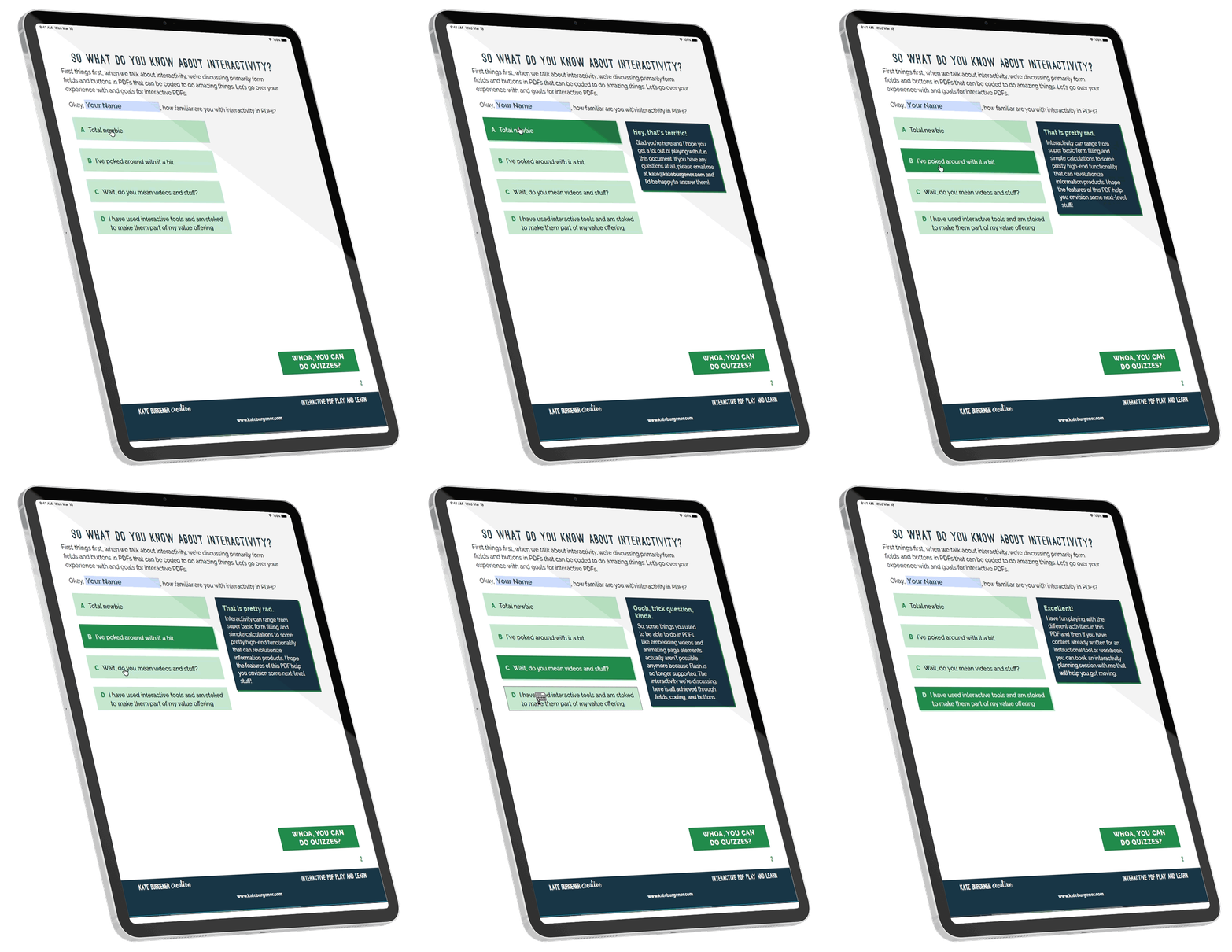
Have a related idea that doesn’t quite fit into the narrative flow of your text? Side bars are perfect for this. Find a special way to capture this text, with a colored field or outlining, special formatting and separation from the main text. This element is especially great for providing quick facts about your material or highlighting a special program. As you create your content, keep side bars in mind so you can separate out appropriate pieces of text that support your main ideas.
Accent Colors
Whether you are working with brand colors or just adding some fun to the document, colors convey personality. Dark or muted colors are professional, bright colors are bold, and softer pastels are delicate. Use colors in design elements such as headings, pull quotes, and sidebars to bring your document together. Use the same palette across related documents to tie them together or pair one stable brand color with a variety of accent colors across a series of documents. Use colors to differentiate courses, subject matter, target clients, etc.
High Quality Visuals
Pictures and illustrations that capture the tone of your text can do a lot of work to convey your message. Take advantage of different media by having your visuals support your ideas and do some of the talking for you! Planning what visuals you might want to represent your ideas and message as you write the content saves you time in the end.
These are just a few of the approaches I use to create professional and polished documents for my clients. Want 5 more design elements? Head over here and get your copy of all 10 tricks! I ended up leaving one of my favorites out of this post, so check it out!


0 Comments