Working with a Designer
Posts to help you work seamlessly with your designer or pick up some DIY tricks yourself!
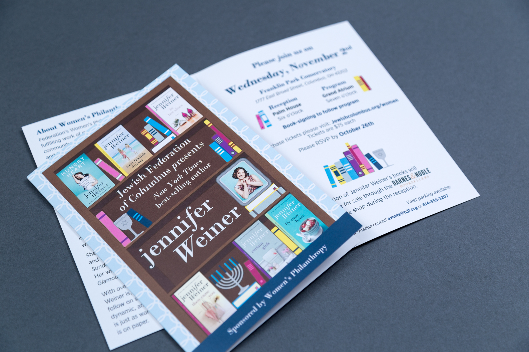
Using corporate branding to create event branding
We see it a ton: shared events with bright graphics zipping through the timelines of our social media feeds. Aunt Marie thinks you need to know about this speaker in town, your old babysitter is pumped about a fundraiser to help shelter dogs, and your kid’s classmate’s dad has shared the same tech recycling drive event three times.
There is a lot of noise in the events industry and one of the best ways to cut through it is to use your branding in smart ways to build recognition in the fraction of a second as the graphic scrolls past on social media. This can involve a lot of different aspects, so let’s dive right in
Brand colors
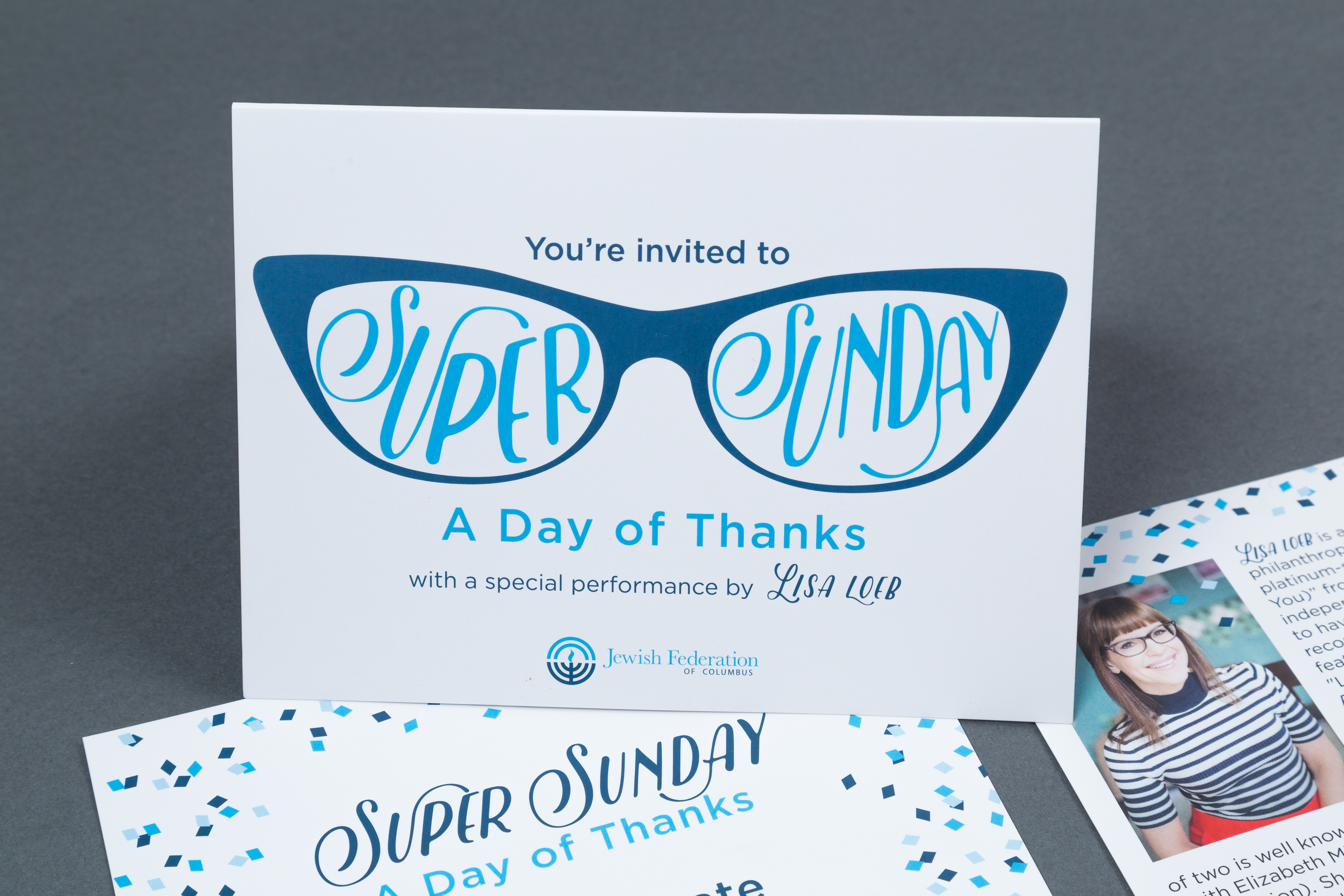
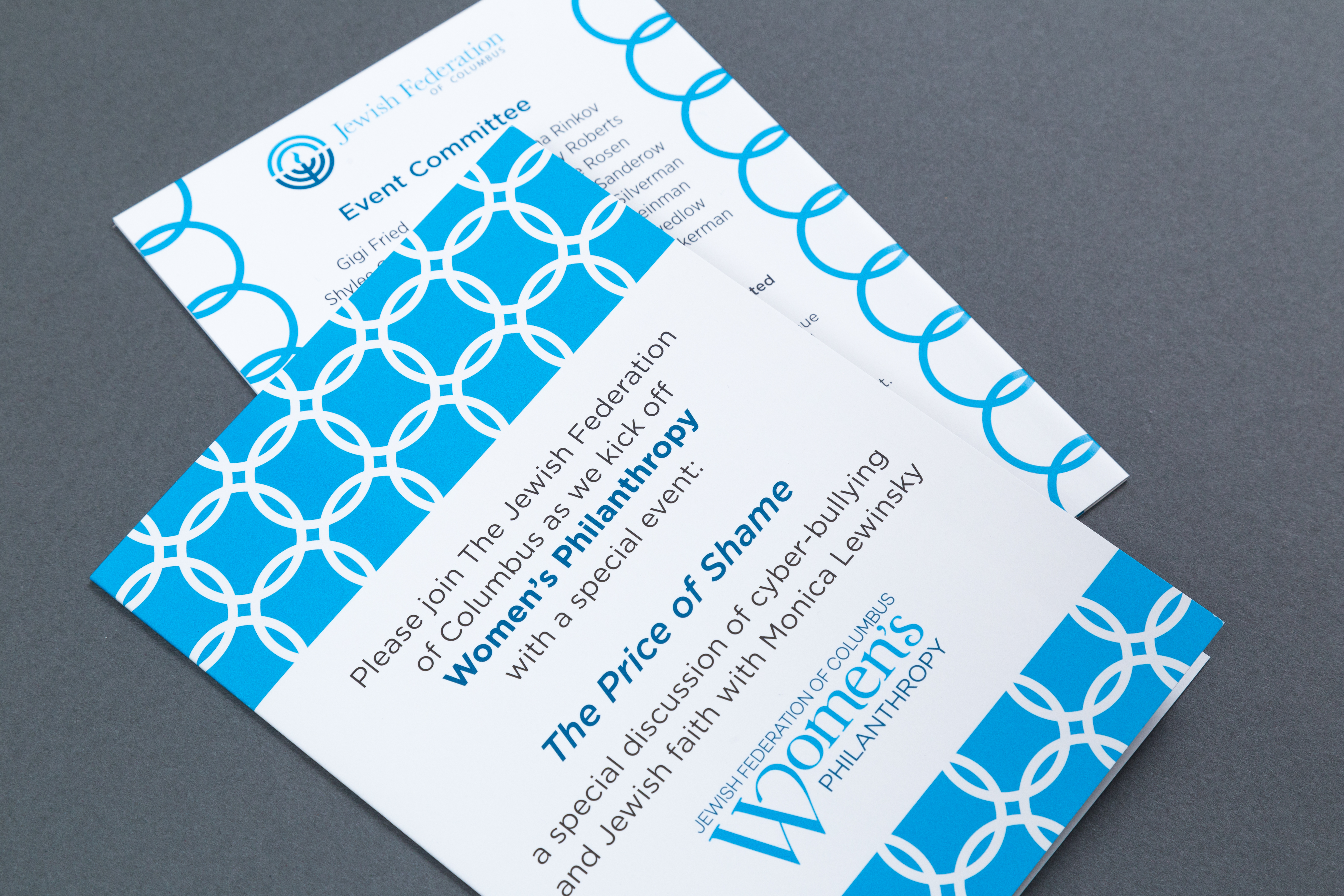
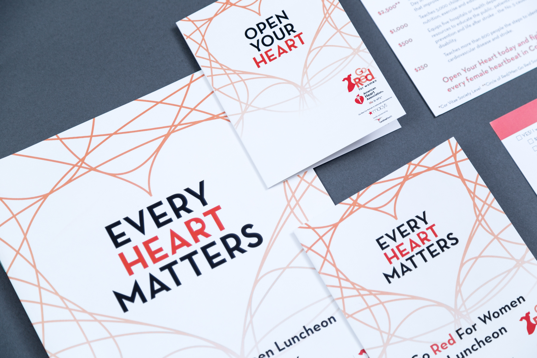
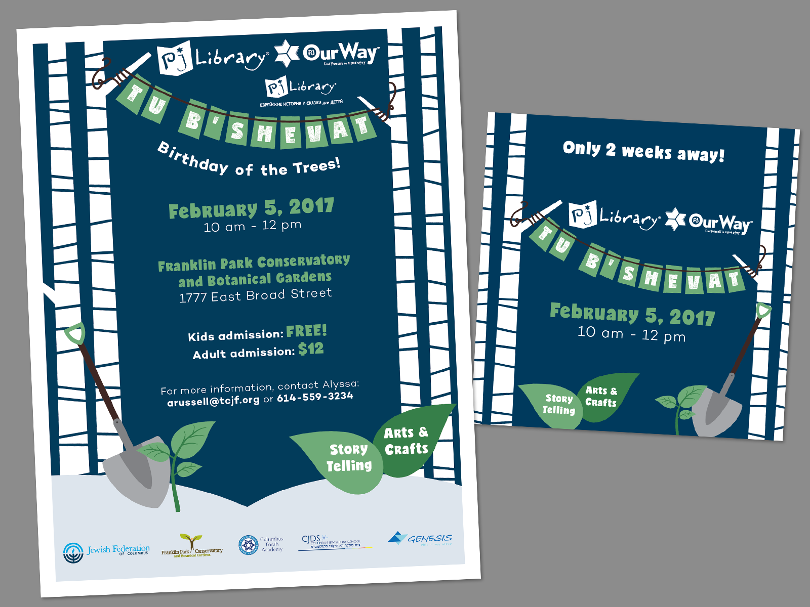
One of the easiest things to incorporate into your event branding is your organization’s or company’s official brand colors. Setting text, graphics, backgrounds, and more in the brand colors can be extremely useful to help people identify your event with you. Color can create very powerful associations, with some colors being very common to particular industries. Anytime you can help a viewer make a connection faster, that’s golden.
If you have a limited color palette as part of your branding, consider expanding it using different tints of your main colors. Or work to develop a few alternative accent colors that will work well to bring brightness and interest to your graphics. Just be sure to communicate the new palette throughout your organization, because consistency is key!
Icons and shapes
If your logo is just the name of your company set in a distinctive typeface, skip on down, but if you have an icon or shape as part of it, try incorporating it! I often look first at shapes within a logo and see how I can incorporate them into a graphic. A lot of companies may use circles, squares, triangles and other items as part of their branding strategy, so make sure to experiment with the forms! You can use a shape in an obvious or more subtle way, and it can be made with photos, graphics, or even negative space!
Typography
If your branding has a particular font that the name of the company or tagline is set in, try to incorporate it into your event graphics in headlines, detail text, and more. This is especially useful if it’s very distinctive, as it’ll help the viewer make the association faster!
Logo presence
And finally, always use your logo on your materials. It doesn’t need to be the most prominent part, or even near the top, but if you do get someone to pause for a second and scan to learn more, a recognizable logo will build recognition and trust. “Oh, hey, I know that group” is a lot more effective than “huh, okay, another kids’ event.” As a bonus, if you’ve incorporated elements of your branding into the event graphics, it’ll feel even more cohesive when your logo relates to specific parts of the design!
Don’t lock yourself in
One word of caution, though! While your organization’s branding is a great jumping off place for your event-specific branding, it’s not the end of what you can do. In many of the examples above, you’ll spot fonts, color palettes, and graphics that relate to the event itself, the audience you’re trying to reach, and the tone you’re trying to set. The trick is to make them complementary to your branding so everything works together seamlessly.
Combine your corporate typeface with a fun accent typeface that connects to the subject matter. Pick some event-specific colors that work beautifully with your main brand color. Choose graphics that relate closely to the specific audience you’re trying to attract. And make all of your graphics consistent, from the first save the date newsletter mention, to the day-of materials, to any thank you or wrap up posts you make on social media!
0 Comments