How to Improve a Conference Attendee’s Experience – A Case Study
I recently worked with one of my clients to create a program for a national conference that they organize. The program had to be highly functional for conference attendees, look beautiful and professional, and convey a lot of detailed information. Conference booklets can often be dull, unorganized, difficult to read and navigate or have incomplete information. Working closely with the client, I used my skills as a designer to improve on what had been done in previous years and create the best possible experience for the attendees this year.
Listening to the Client
The first thing I needed to do was hear the specific issues that the client felt were cropping up in previous years and causing issues for attendees and staff. We quickly moved away from discussing the “design” of the program and I listened to my contact detail how often people were coming up to ask her questions during the event about how to use the conference app, how to get to the next session, and details about activities. She also stressed the need for a “wow” factor and wanted to do something a little different with their printing budget now that they were eliminating an expensive-to-produce back pocket from the program.
During this brainstorming session, we batted ideas around that could take advantage of the printing budget and improve the experience for the attendees (and the staff who had lots to do besides answering questions already in the program). I proposed the idea of die-cut tab separators for the program and it was an instant hit. It would solve some organizational problems as well as add a little professional polish to the program. I contacted the client’s printer to get a quote on the change and once the client signed off on the price, we moved forward.
Boost functionality of the program
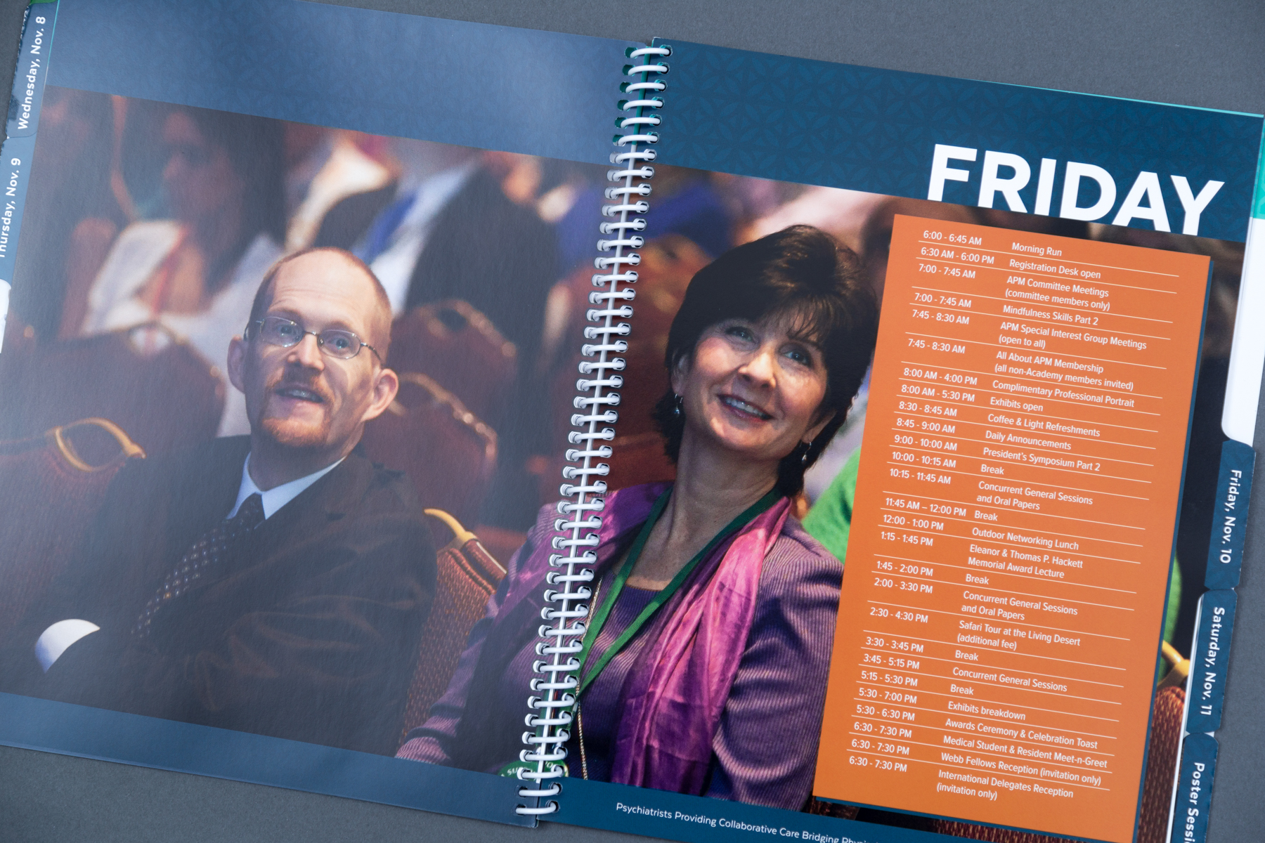
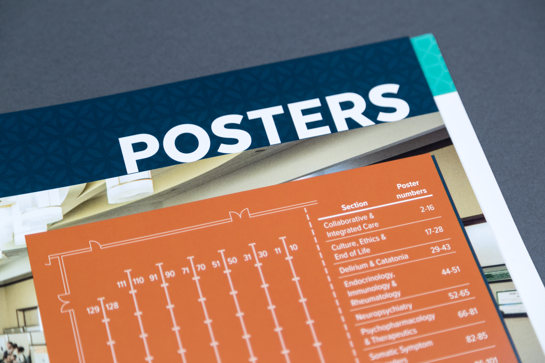
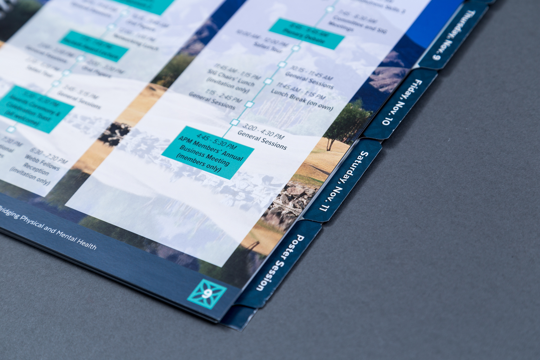
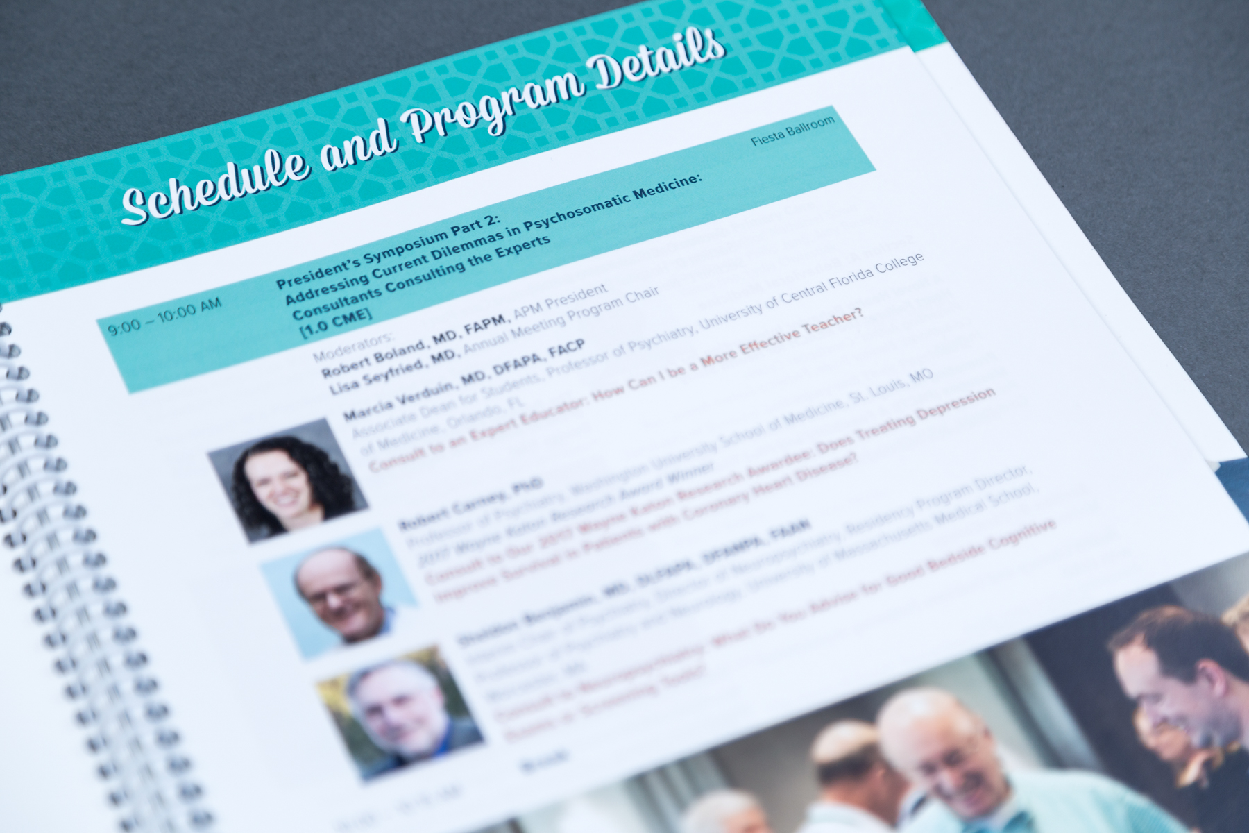
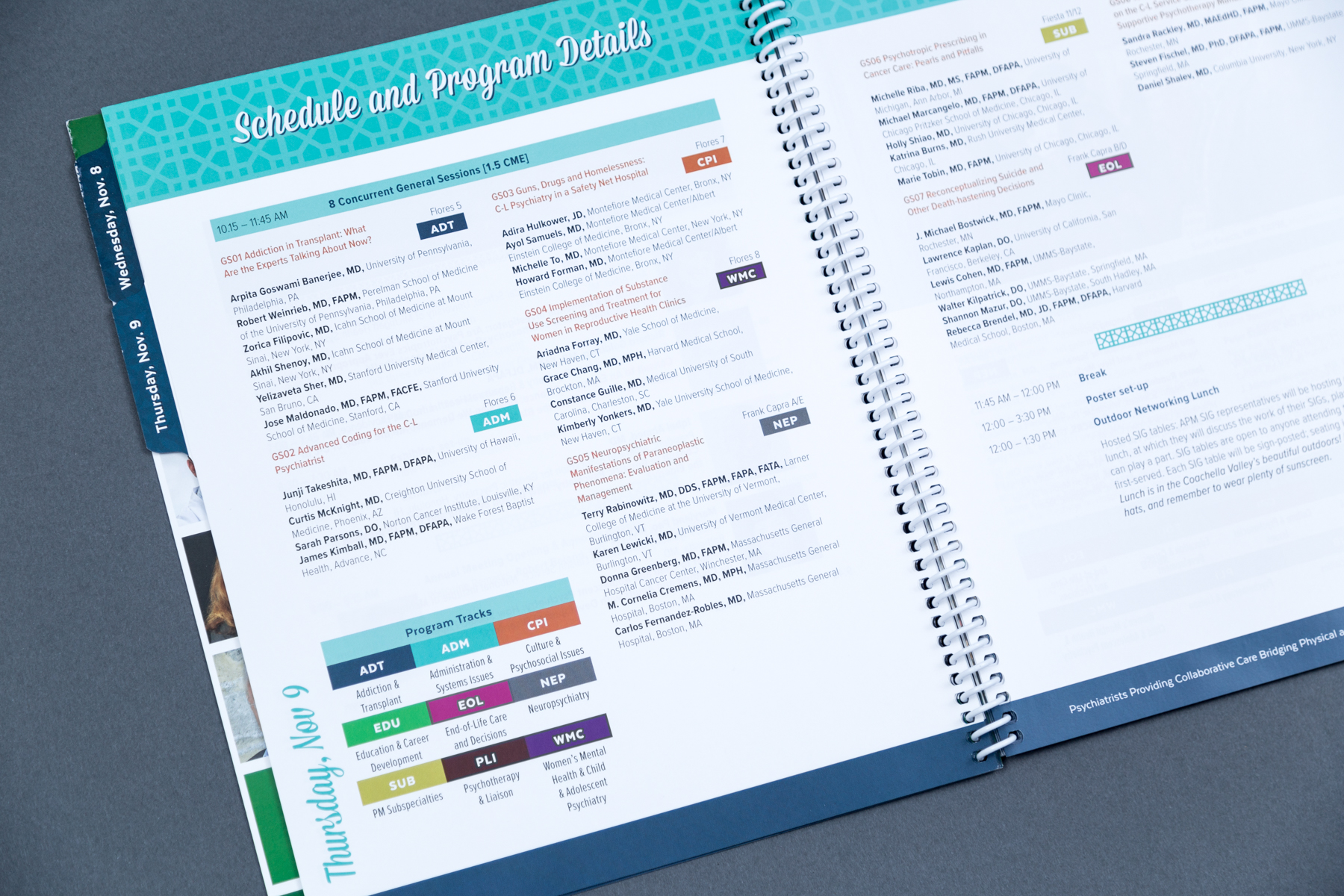
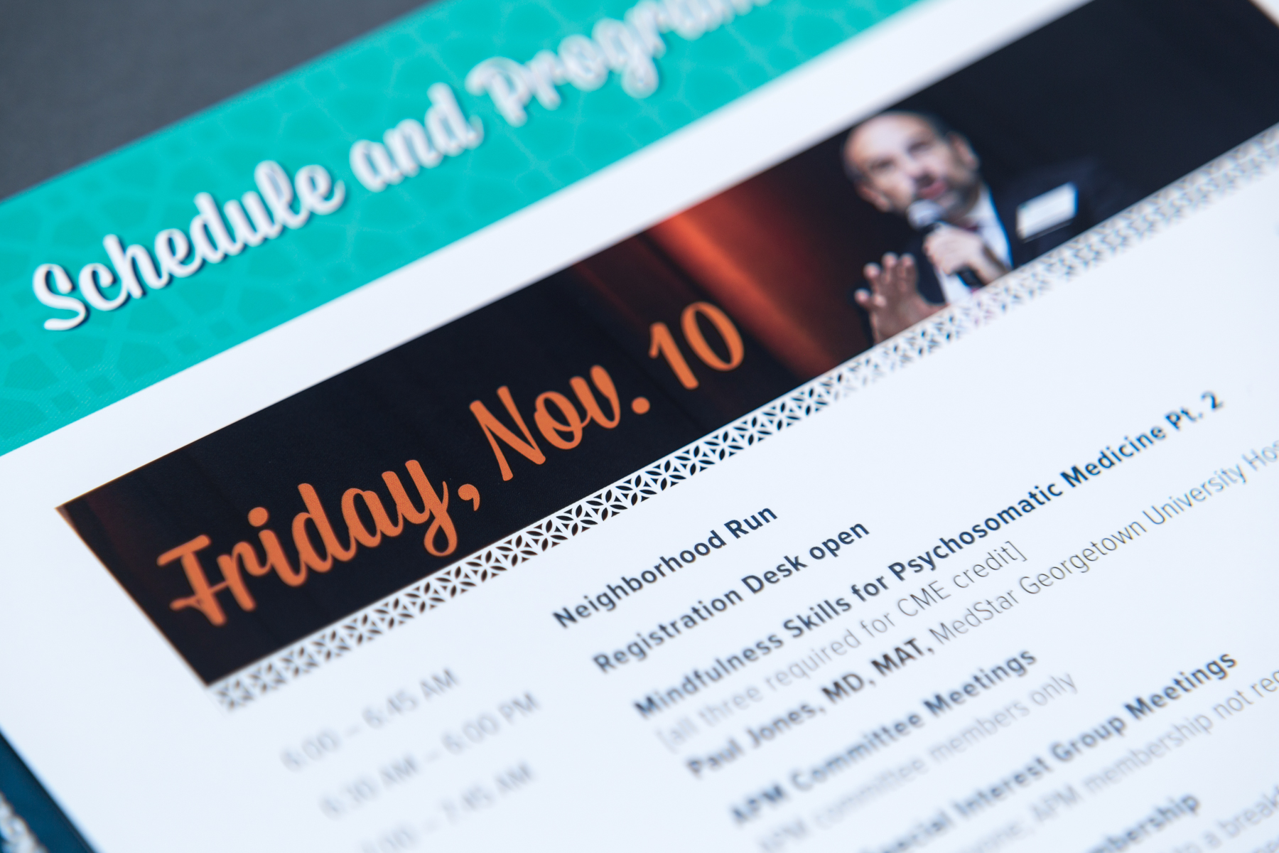
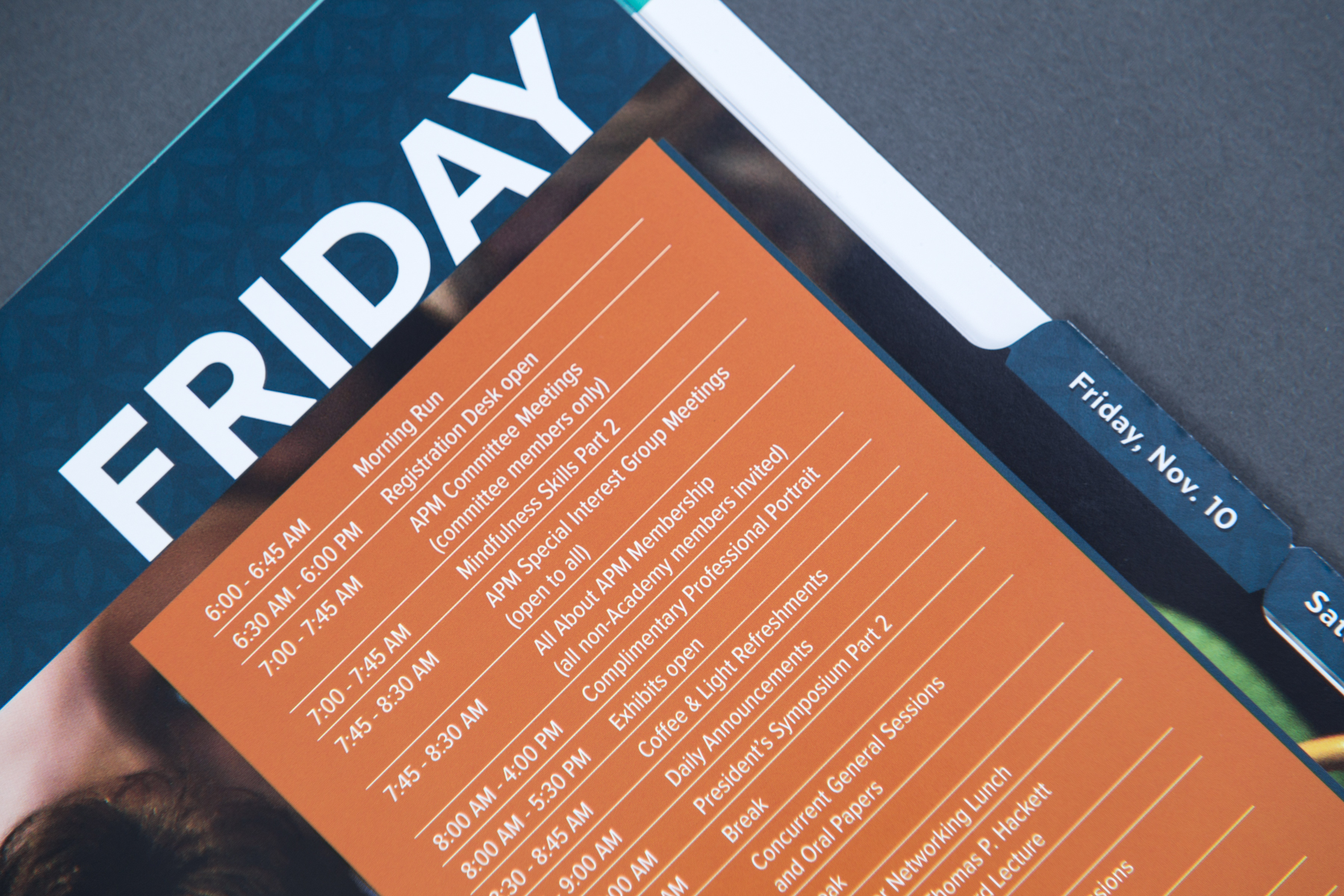
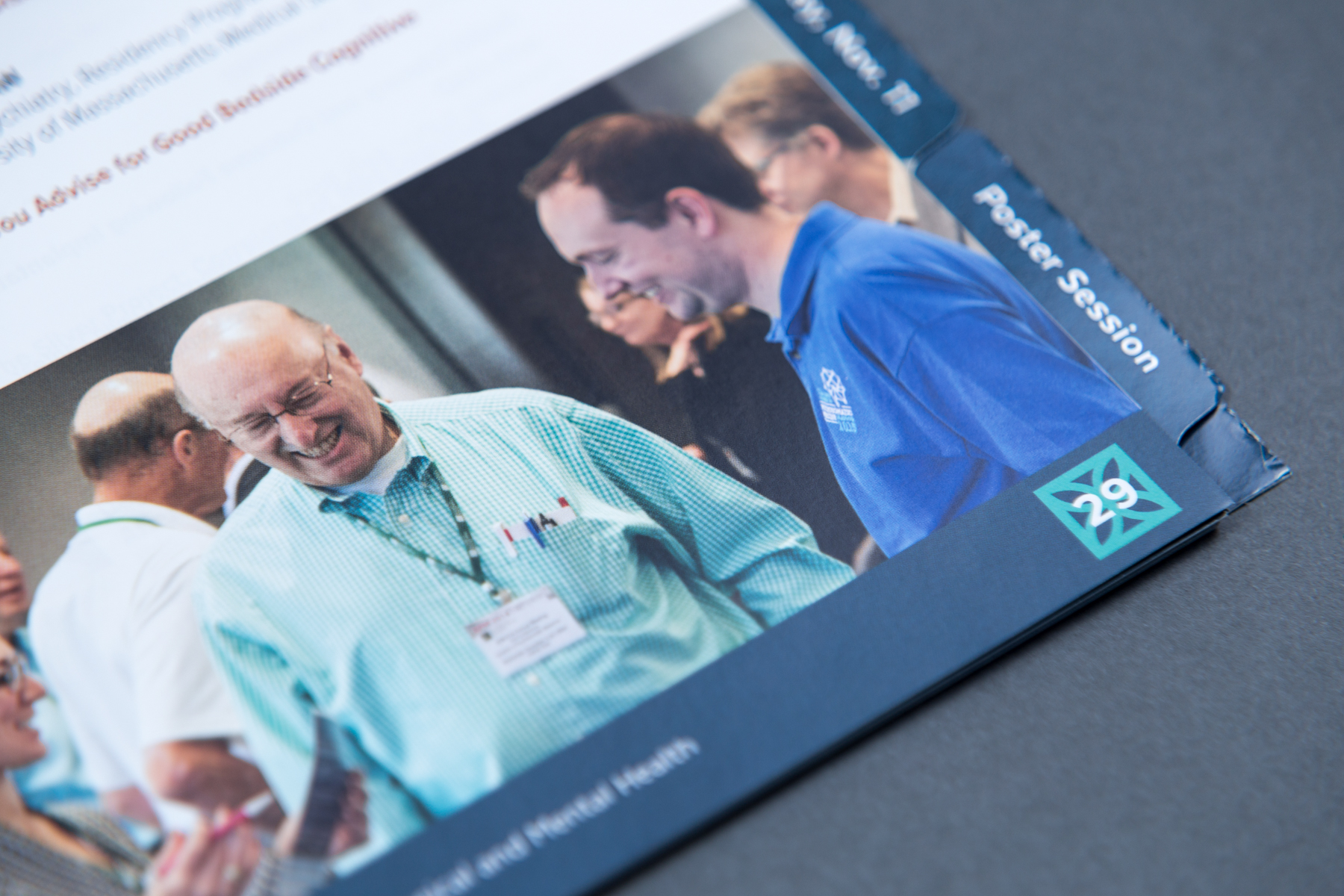
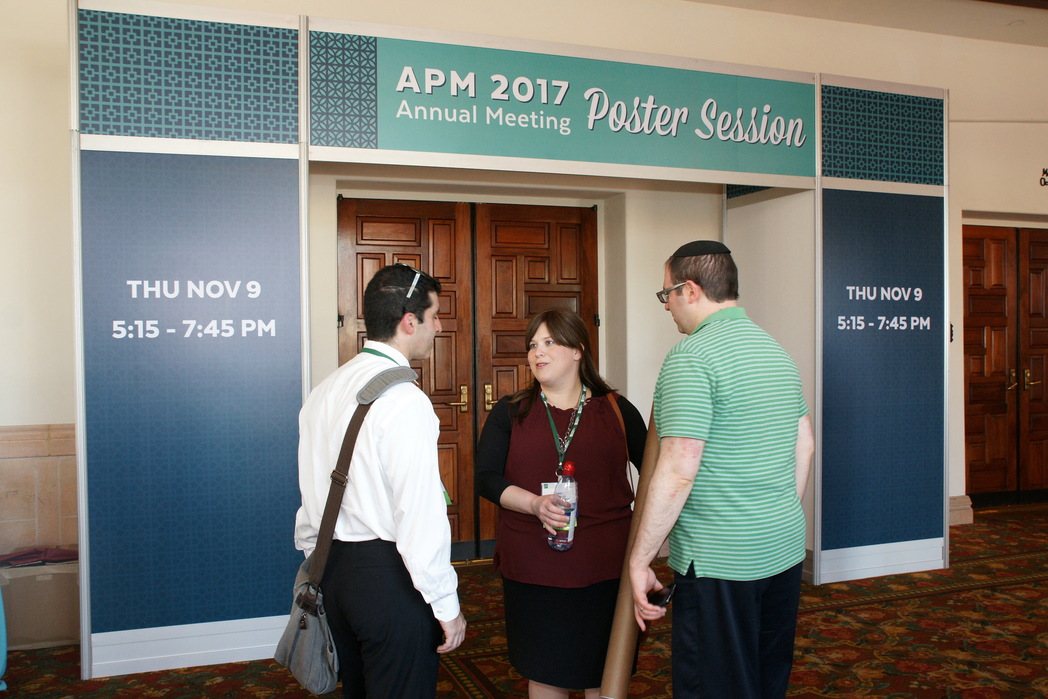
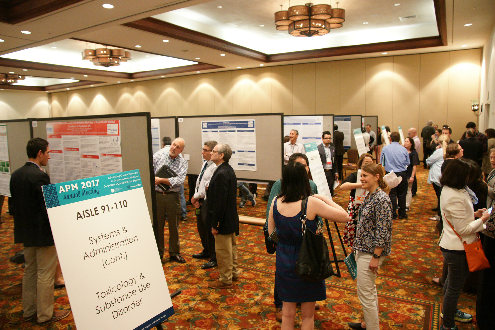
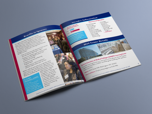
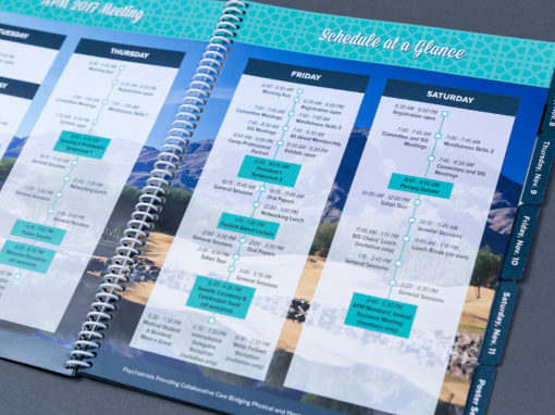
Now that I’d gathered the feedback from the client, it was time to focus on how design could improve the functionality of the program. I knew the tabs were the perfect way to improve how the attendees would navigate the program and get to relevant information quickly. We used the 5-tab die to separate the program with a tab for each of the major days of the conference and the poster session details. I laid out an attractive spread before each day tab with a large photo of previous conference attendees and schedule-at-a-glance box that summarized the important sessions of the day and their times. On the other side of each tab, the detailed breakdown of the schedule started for each day. Adding this navigation feature helped attendees quickly identify which sessions to prioritize and plan out their day, as well as getting quickly to the more detailed information throughout the conference. The final tab marked the start of the poster session and the two-page spread there featured a map of the posters and breakdown of the sections so the attendees could easily locate the subjects they were most interested in.
I also made some other changes to how the program was previously laid out to solve some of the attendees’ most common problems. I moved the instructions for the app to the first page so the attendees could find them immediately (or the staff would be able to direct to them right away). In previous years the instructions had been part of a pre-made full-page layout with generic language from the app vendor and had been buried somewhere in the middle of the program, wherever there was room. I worked with my client to create a simpler, smaller layout that would fit just under the table of contents, with plainly-written directions on use.
To help the attendees physically navigate the conference space, I used the inside back cover to feature the hotel maps provided. These maps had been in the “back matter” of the program in previous years, somewhere after the schedule and poster session details. By placing it in a prime spot that made it easy to turn to, attendees were able to quickly figure out how to get to their next destination.
One final functional touch was a schedule-at-a-glance spread that showed all four days together. This highlighted important sessions and activities that would help people plan their general conference experience. This abbreviated schedule was also made into large-format signage used throughout the convention.


Getting the details right
The organization of a robust conference program is highly important. Using repetitive design elements such as color, headings, text treatments, and page layouts effectively “trains” your attendees on how to use the program. Keeping things consistent is important, as well as presenting information clearly.
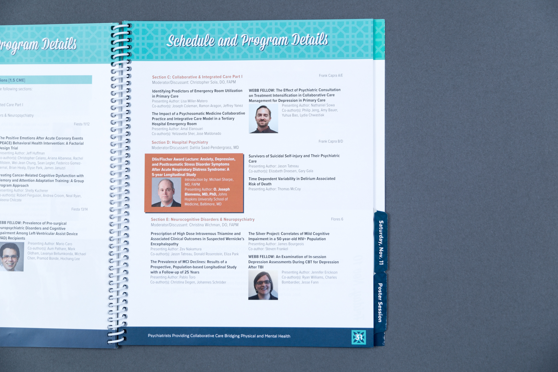
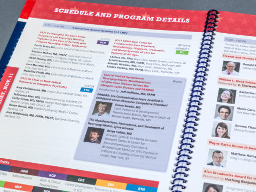
I created a unified approach to presenting the session information that carried throughout the entire booklet. Sessions that had multiple concurrent options kept a strict formatting throughout so attendees learned that all of those were occurring at the same time. Design elements served as breaks to indicate the end of the listings for concurrent sessions, so the reader could choose the session relevant to them and then skip ahead to the next item in the schedule.
I also set up a multi-color key for the tracks being offered by the conference. These keys were repeated throughout the program, making it easy for attendees to identify which sessions were most relevant to their specialties.
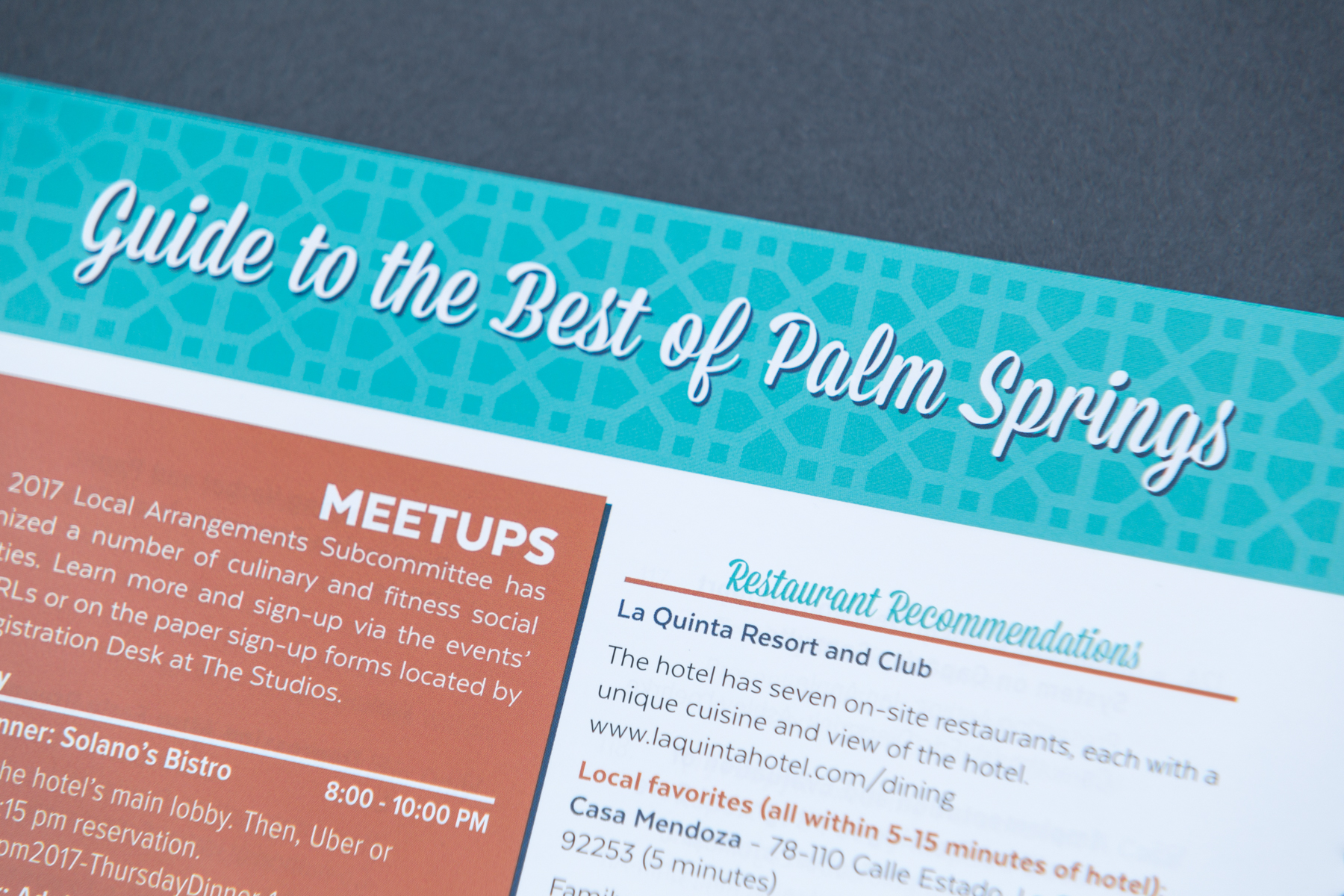
I used orange boxes throughout the program to draw the reader’s attention to important content that the organizers wanted to emphasize. This included highlighted sessions, special events, a conference-specific newsletter, complimentary portraits being offered and more. I also worked with the client to gather a list of all meetup experiences being offered by the planning committee and highlighted them within the local guide, so attendees could join their peers for interesting activities and dinner excursions.
Creating a beautiful, polished program
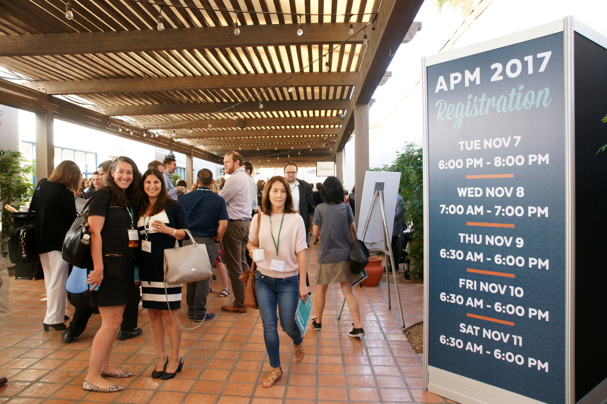
While the functionality and organization of the program were vital, the style of the whole event is really what made it next level. My work on the visual language for the 2017 meeting began back in 2016 when I developed the half-page ad promoting the next year’s meeting. The client frequently uses location-based styling, so I brainstormed on design elements, typography and a color palette that would indicate Palm Springs without being too literal. Together we decided on a concept that uses teal, dark blue and orange, curvy script, sleek sans-serif, layered typography, and three different geometric patterns that call to mind some of the iconic concrete screen blocks found around the city.
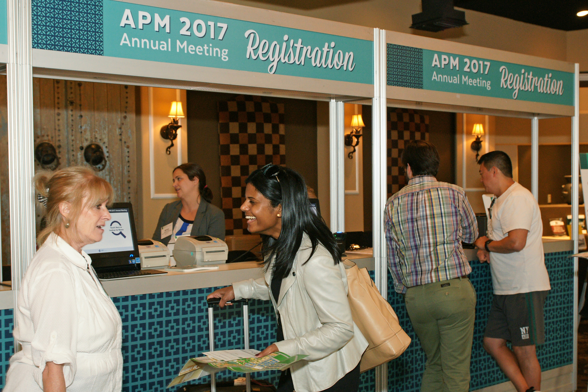
I used this robust collection of visual elements to develop the promotional ad in the 2016 program, as well as a wide assortment of print and digital advertising used to promote the conference in the months leading up to it. Within the program, I used the now-familiar styles in headers, as decorative break characters, as bullet points, and background patterns. The whimsical script added levity to large titles and subheadings. The sans-serif reflected in the cleaner design elements and the layered typography translated to layered box treatments as well. The color palette was limited enough to feel sophisticated and playful, but still provided plenty of opportunity to create a valuable hierarchy of color within the text and page elements. In addition to using the design elements throughout the program, I developed a signage template for the client to use, as well as large-format environmental pieces for the registration desk and poster section.
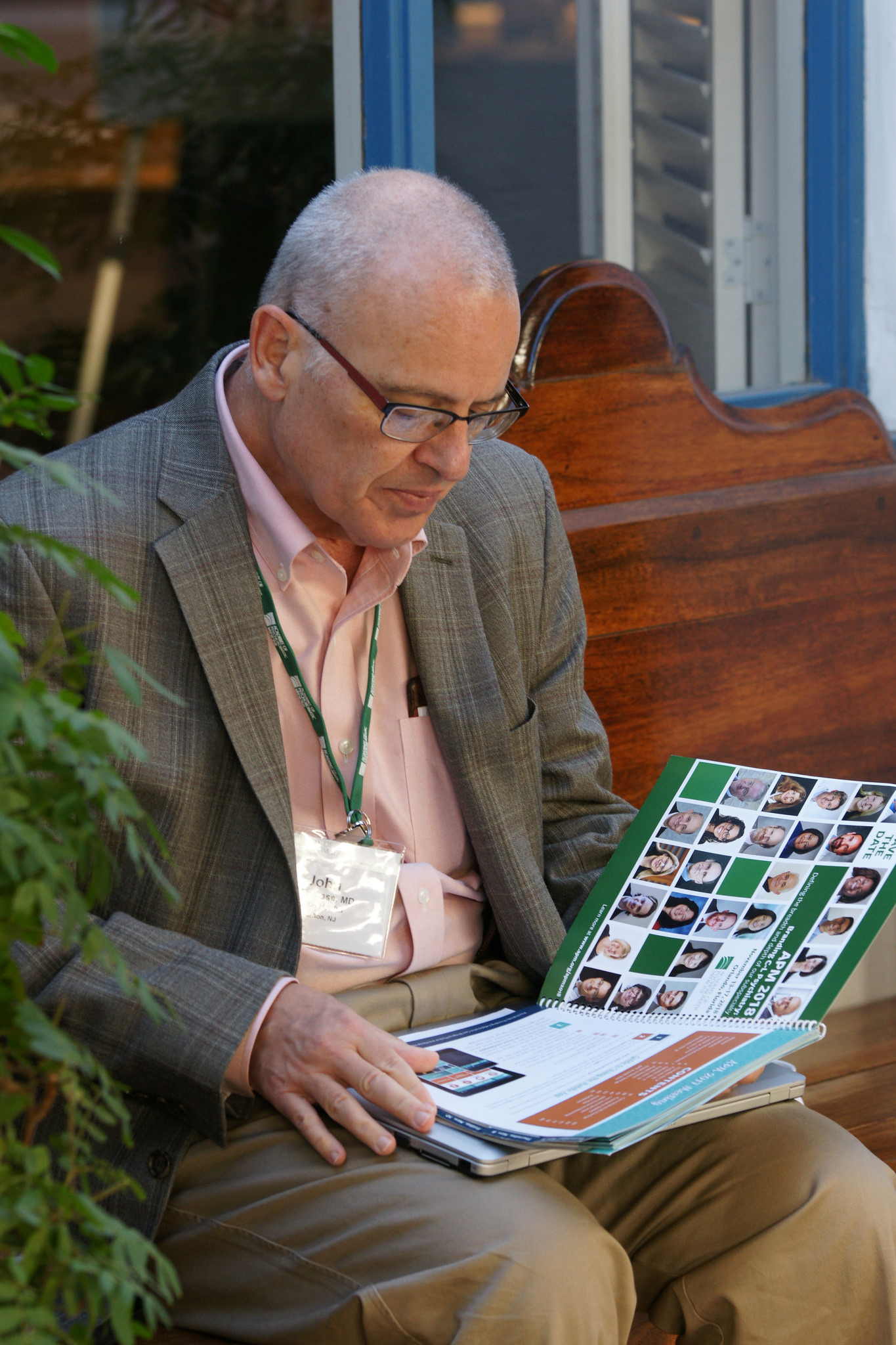
Photography is also very important to this client and they prioritize having a professional photographer documenting each year’s conference. Because of this foresight, we had a wealth of beautiful images available to use throughout the program. I strategically placed these photographs of previous conference attendees to break up long sections of session information and create visual interest throughout the program. The photography showed an incredible diversity of participants that were actively engaged and enjoying their conference experiences. Photographs were also as a design element at the beginning of each day’s schedule details, and select speakers’ and award winners’ headshots were featured throughout as well.


The payoff
The program was developed over the course of four weeks, with several rounds of feedback and fine-tuning. The design was met with enthusiasm by my contact and her boss, the board of the organization, and finally by the conference attendees themselves during the event. I worked directly with the printer and my client to coordinate production and delivery to the conference location.
My contact reported back a few weeks after the conference (as we geared up for promotional materials for the following year, which again started with a save the date ad in this year’s program booklet) that she’d been in contact with a number of attendees who were having trouble navigating the CME credit process. As we’d covered this procedure in the back matter of the booklet, she asked each person whether they still had their onsite program to turn to the specific page. Each one said they had kept it. (And next year, we’ll add the CME process as an entry in the table of contents.)
By working closely with the client to understand how my work could solve the problems they’d been having, we were able to develop a useful and beautiful program. It improved the experience for the attendees and represented the organization in a professional and eye-catching manner.
Conference photographs used with permission of the Academy of Consultation-Liaison Psychiatry.
Solve problems and achieve goals
Check out the portfolio page for this project
More Conference Projects
Let's get started on your conference materials today!
