Medical Society Annual Event Branding and Materials
The Need
The Medical Society of the District of Columbia recently had a change of leadership and wanted to focus on freshening up the output of the organization, to better connect with their membership and related parties. I was brought on to modernize the materials for the annual meeting and awards ceremony.
The Project
For promoting the event, MSDC needed a sponsorship prospectus as well as digital graphics for the website, social media, and their newsletter. Day-of materials included a 20-page program and a variety of signs.

The Process
I started by developing complete event branding for the meeting: a palette that incorporated MSDC’s brand colors, subtle pattern options, and typographic treatments for all materials. The branding had to be flexible to adapt to print and web materials, with variations.
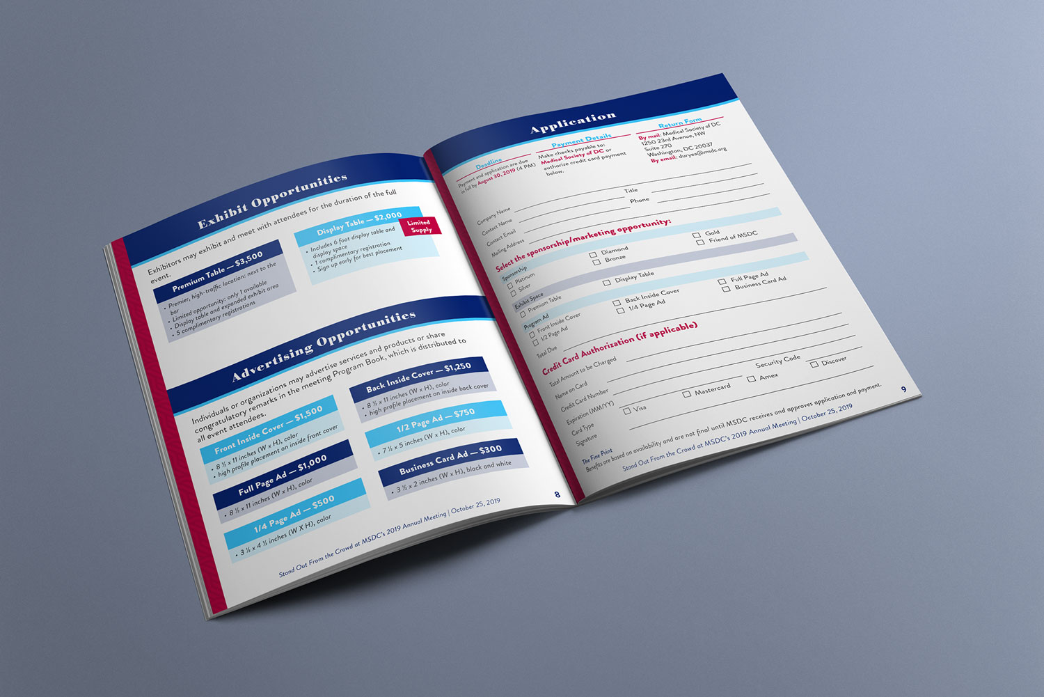
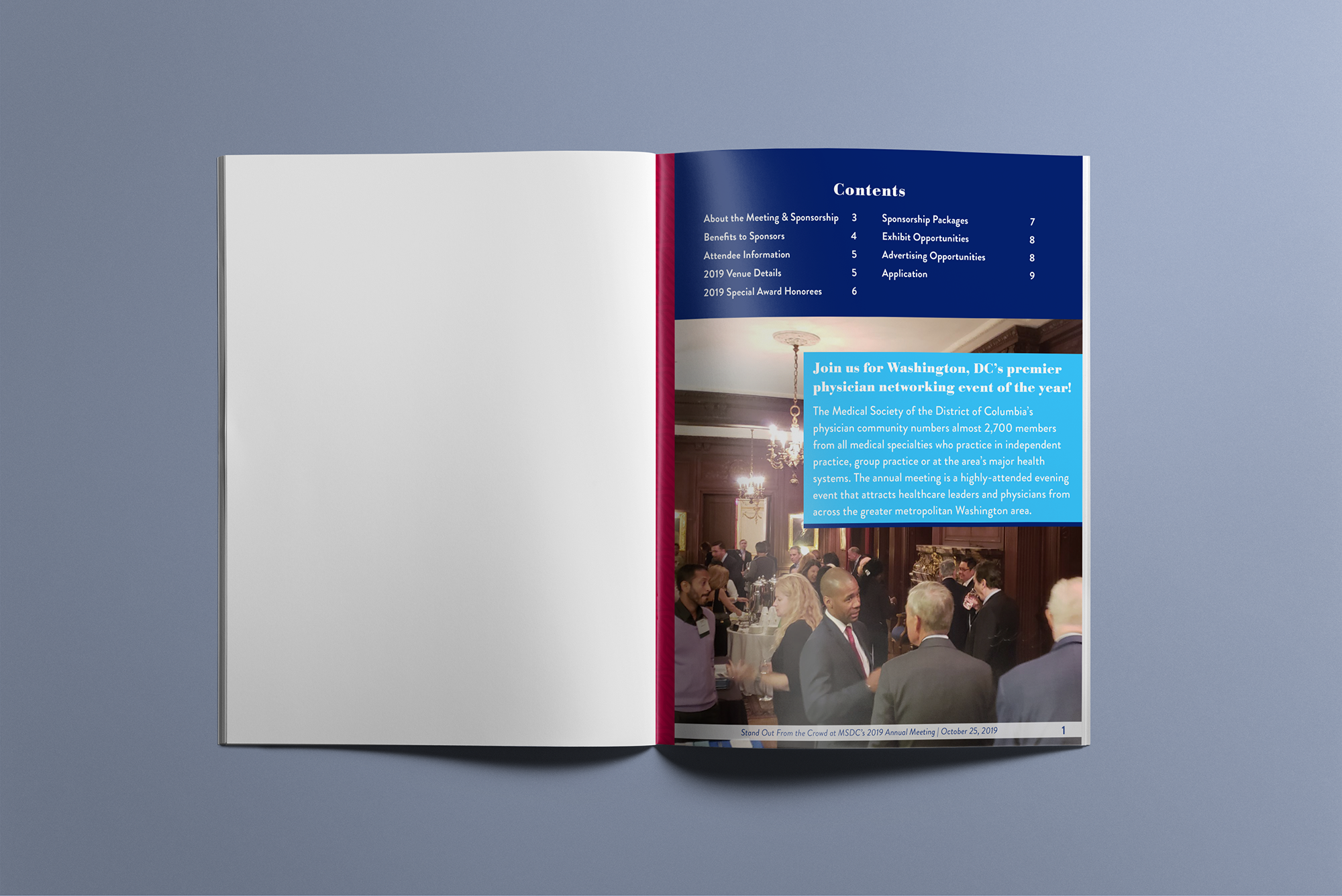
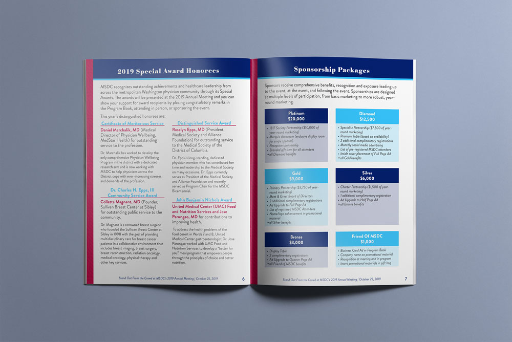
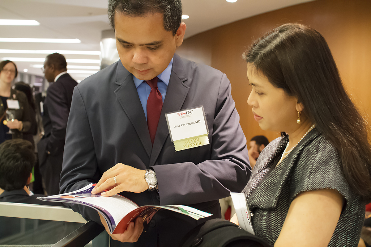
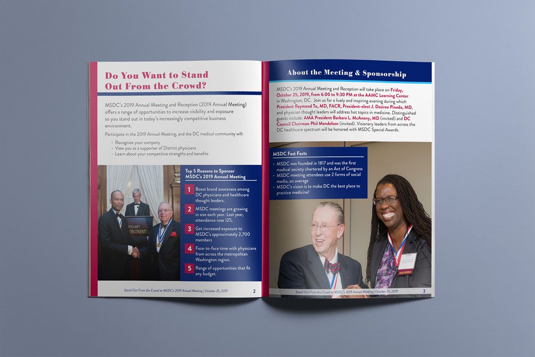
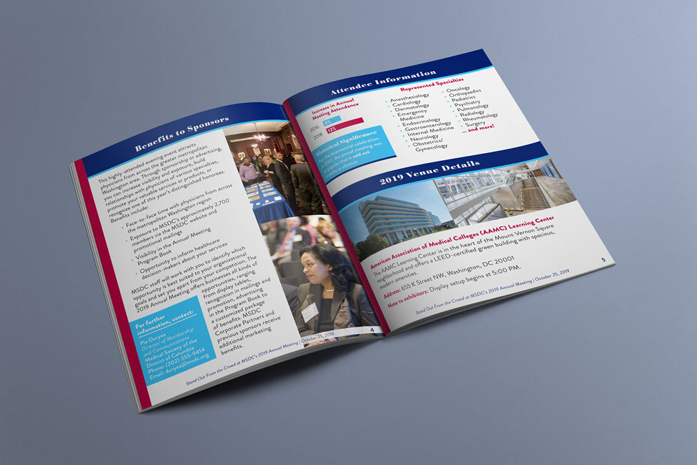
In building the prospectus, I encouraged MSDC to create sidebar content to break up the body text, draw reader’s eyes around the page, and provide easily-digestible tidbits of information to further entice sponsorship. I created a visual system for the information, including call-out boxes and sidebars, color-coded tiered sponsorship levels, and an attractive application form with fillable fields to remove barriers to completion. A variety of photos from previous years’ events rounded out the prospectus, to give potential sponsors a feel for the atmosphere.
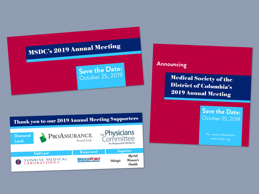
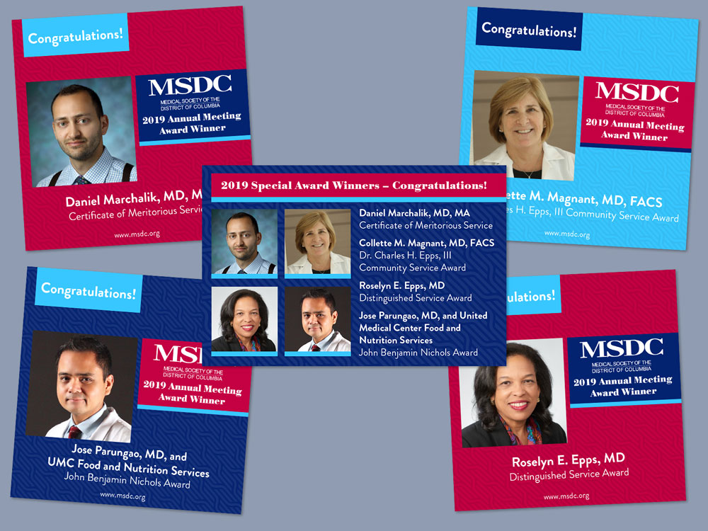
Next I turned my attention to the digital graphics for use on the website, in the newsletter, and across multiple social media platforms. For in-stream content, I used the event branding to its fullest potential, creating brightly-colored and varied graphics with limited text, to catch people’s attention. The headers across the social media platforms and website created unity in the event branding.
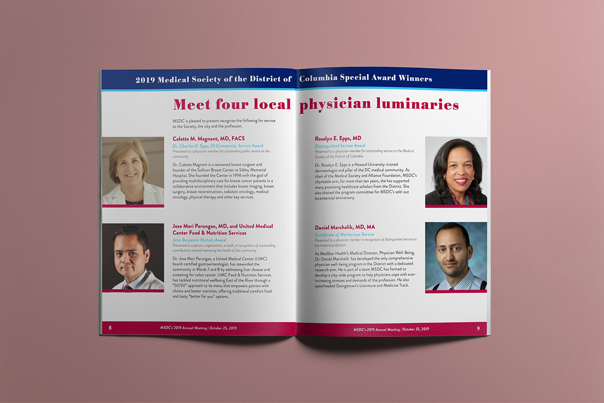
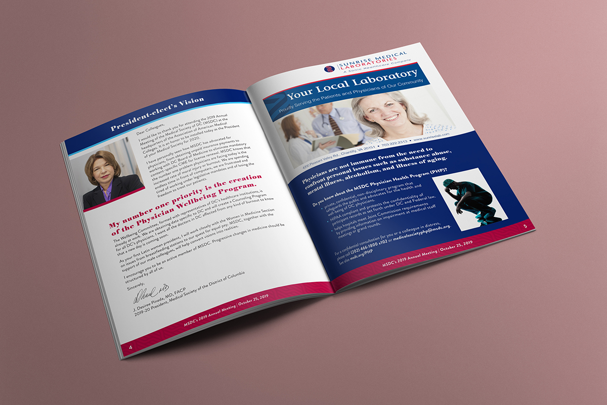
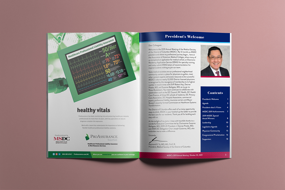
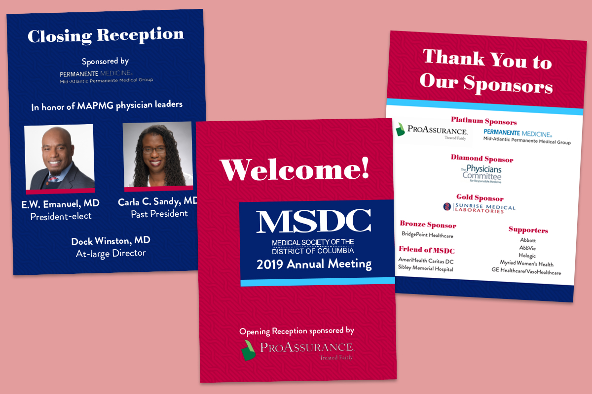
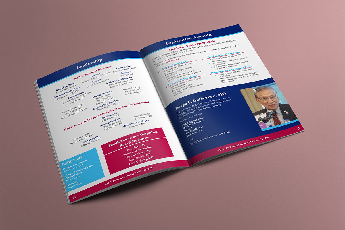
The program used bright and fresh magazine styling to engage the reader, with pull quotes and large contributor and award recipient photos. I used element treatments seen in the web graphics and sponsorship prospectus to create cohesion. The agenda page used hierarchy to help people identify important information quickly. I used the flexible meeting branding on the signs to keep them from being repetitive while welcoming attendees, celebrating sponsors, and honoring physicians as part of the closing reception.
The Results
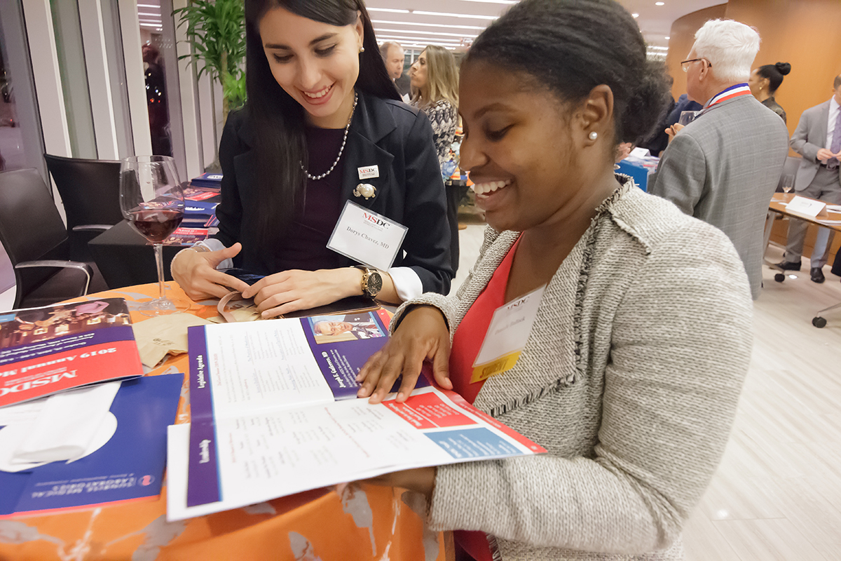
The meeting was deemed a success by the organization and the board, with engaging and cohesive materials that made it easier to communicate with members, solicit sponsorships, and enjoy a party celebrating the best and brightest of the medical community in Washington DC.