How to breathe fresh life into a 10th annual event – A Case Study
A few years ago, I worked on the materials for the tenth annual Go Red for Women luncheon in my city and I wanted to share some of the ways we made this anniversary of fundraising and sharing life-saving information particularly memorable. The Columbus chapter of the American Heart Association regularly puts on one of the top-earning Go Red for Women events in the country, so when the tenth anniversary of the luncheon was being planned, it was vital to them to really make a splash. Here’s how we did it.
Listen to the client and the objectives
The first step in any collaborative process with the client is to have a frank discussion of their objectives and what they want to communicate. I sat down with the event planner and three members of the American Heart Association chapter’s staff several months before the event.
The AHA staff members emphasized that because this was the 10th annual luncheon, this was the year to do something bold and memorable. They wanted to create a big impact and have messaging that really stuck with the attendees and anyone exposed to the promotional materials for the event.
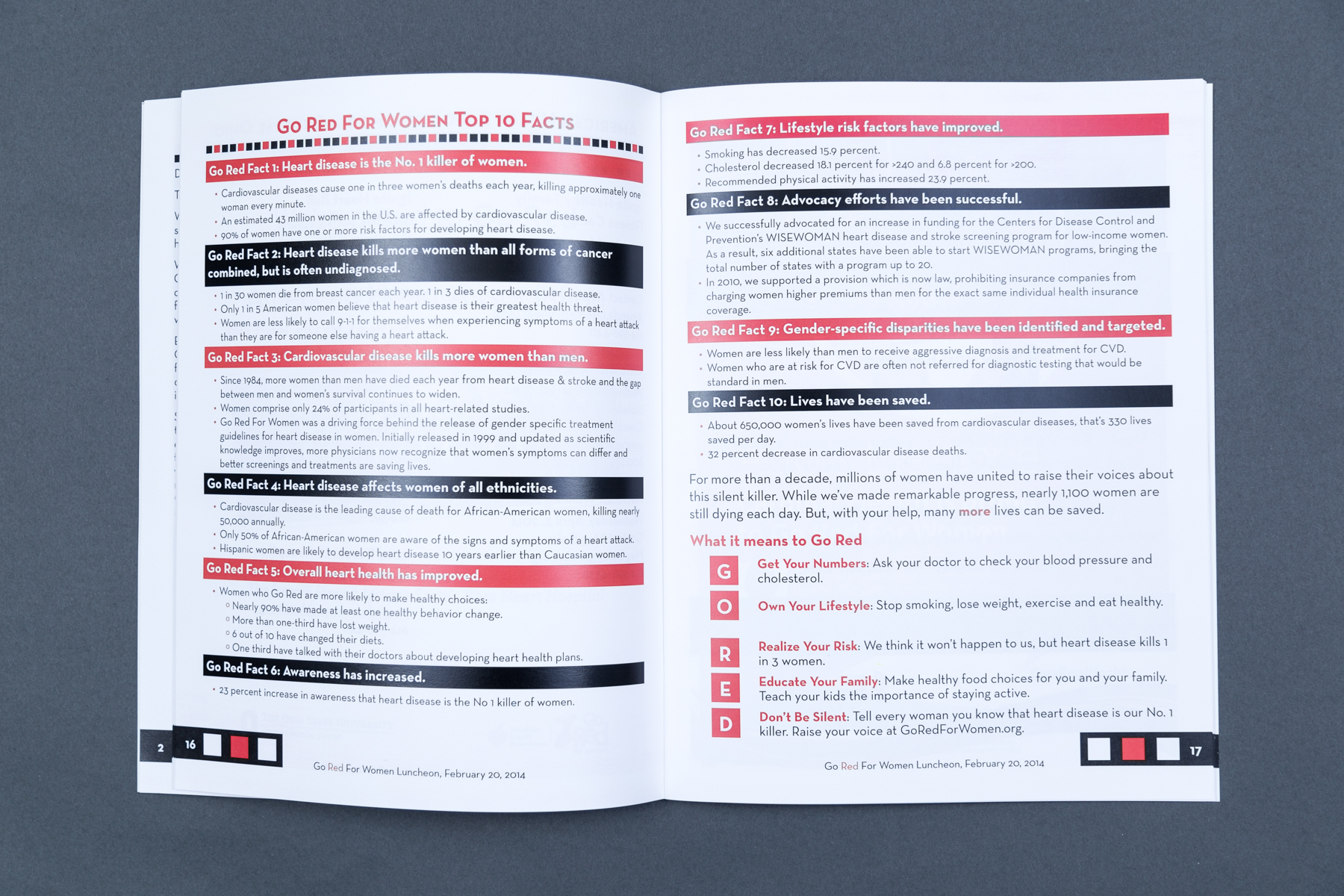
I asked questions about what the most pressing issues were today and learned that 1 in 3 women suffer from cardiovascular disease. We also discussed the possibility of making the materials feel very connected to Columbus to highlight their position as one of the top fundraisers in the country. We reviewed some of the work that other chapters were producing that the staff members admired, so I could understand how the messaging is often presented and would fit into a larger national narrative.
After the meeting, I brainstormed several concepts that emphasized boldness, place, and action. I created rough concept drafts to demonstrate how the different visual styles would be applied across the materials and showed the fullness of each approach. The staff members were enthusiastic and excited about all three concepts, but chose the 1 in 3 approach to move forward.
Creating a striking visual to support the messaging
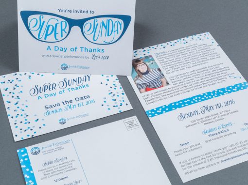
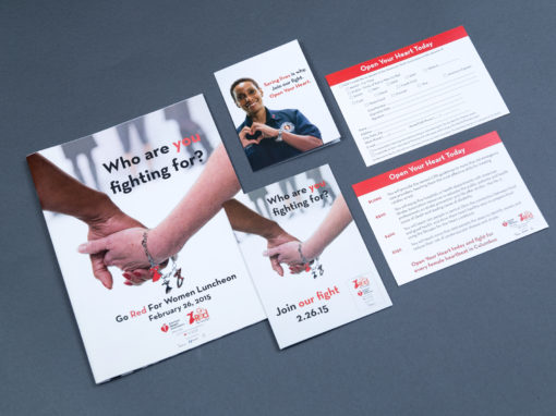
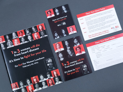
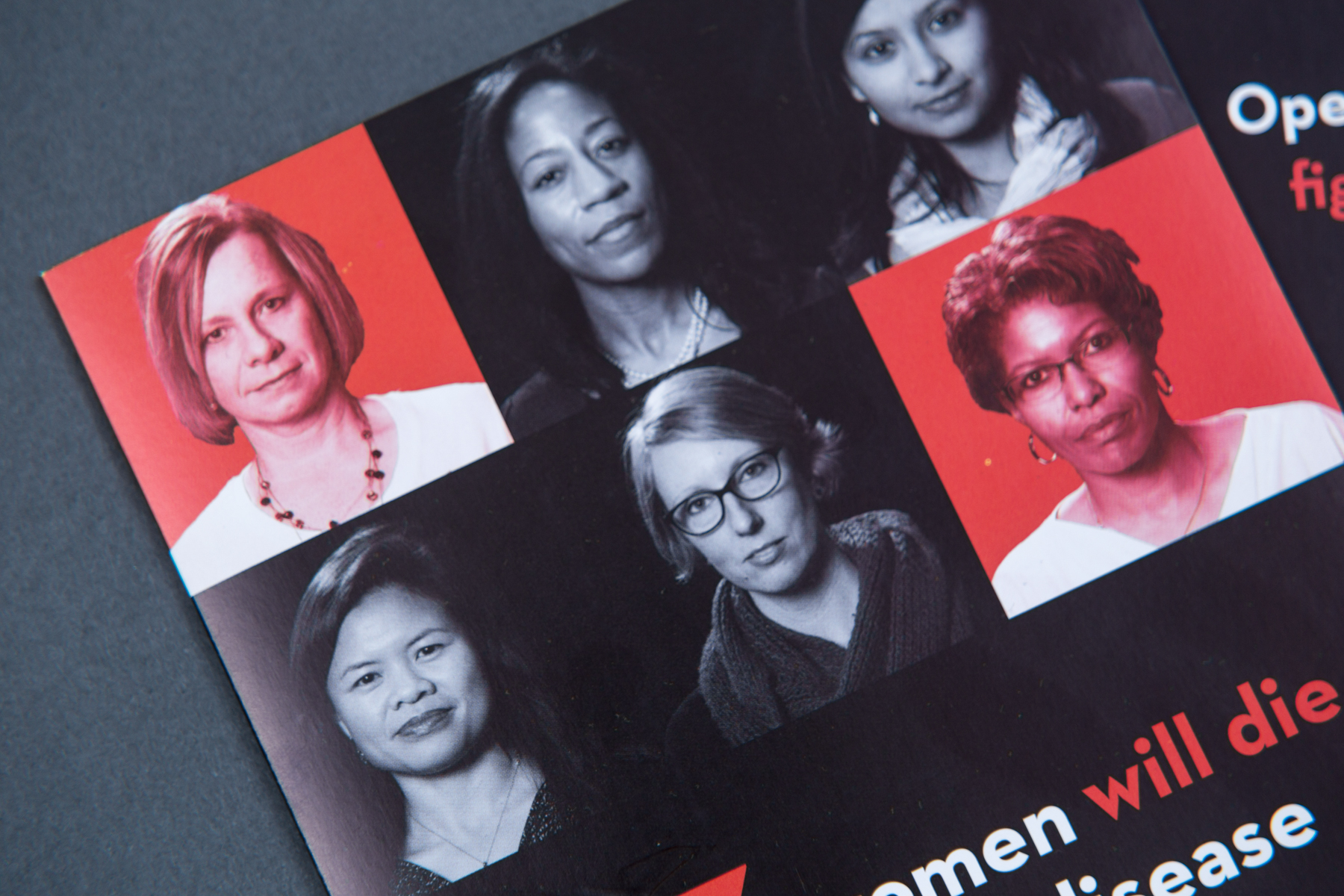
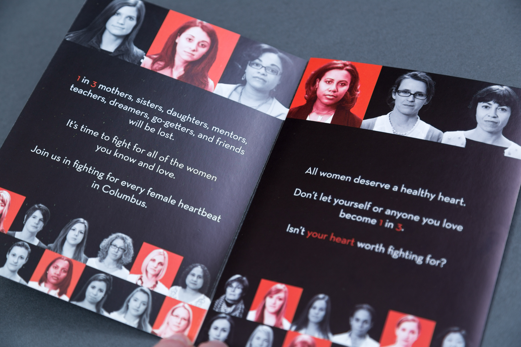
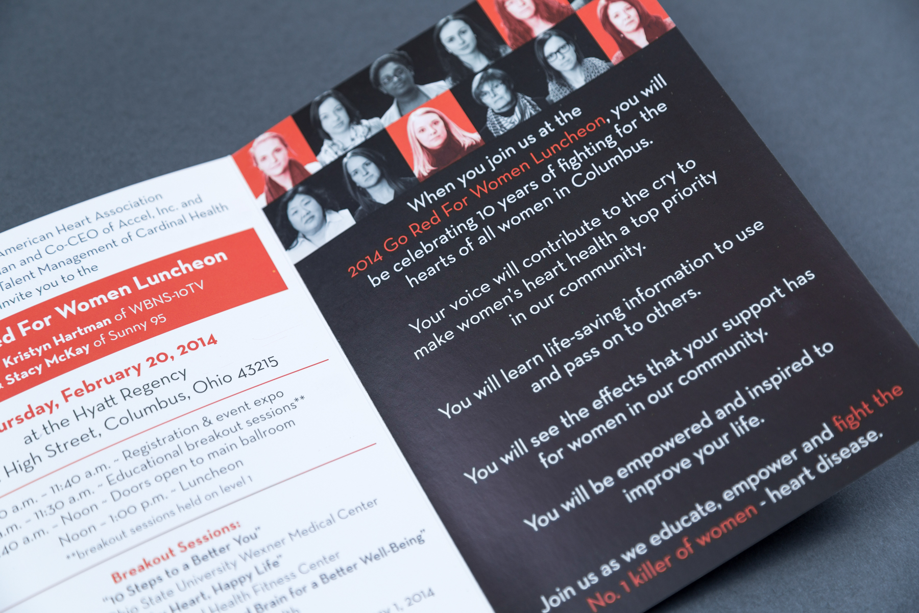
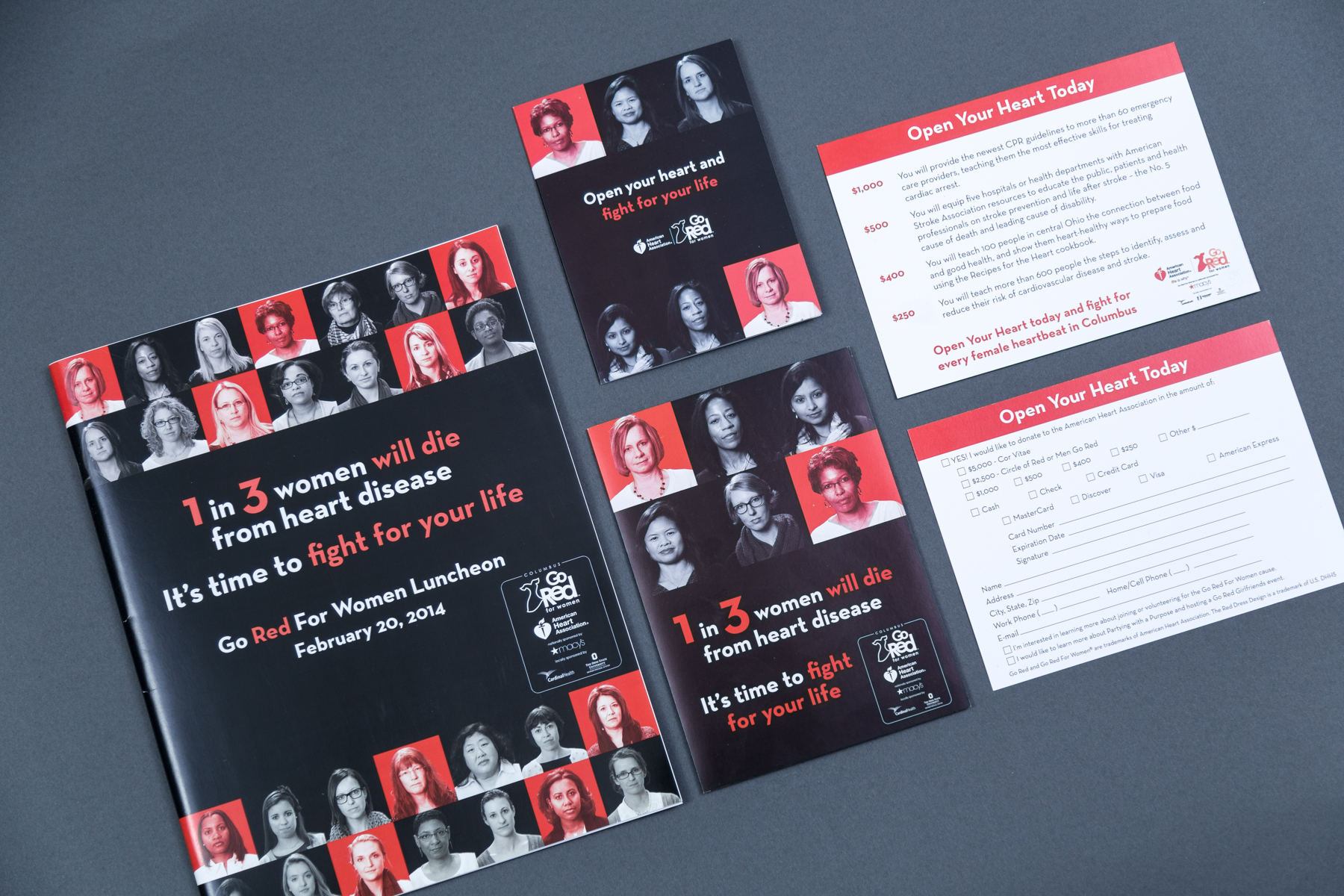
The basic idea of the 1 in 3 concept was to show beautiful, strong, and solemn portraits of a variety of women in the community and to tint one-third of the photos red to demonstrate the wide-reaching affects of heart disease and stroke. By marking 1/3 of the women, the impact was very clear and the urgency of supporting the work of the American Heart Association was communicated.
In creating the concept draft, I pulled inspiration from a successful campaign that the New York City chapter had developed and chose stock photography comps of women who looked proud and defiant. This strength resonated with the message that while the current affects of cardiovascular disease was wide-reaching, we have the power to change it through research and education, both goals of the American Heart Association.
Once the concept draft and direction were approved, I worked with the staff members and a photographer to set up shoots of women in the community in the strong and determined posing that we were looking to use. The staff members were able to get volunteers from a variety of their sponsors to pose and we focused on representing diversity in race, age, and body type, to show how heart disease can affect any woman. I assembled the photographs of the women into a grid layout, tinting 1/3 of the models, but making the red squares random, to further emphasize that any woman can be affected.
Consistency across all materials
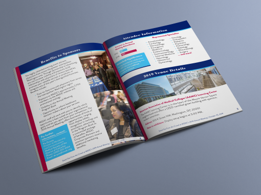
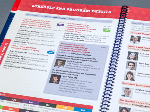
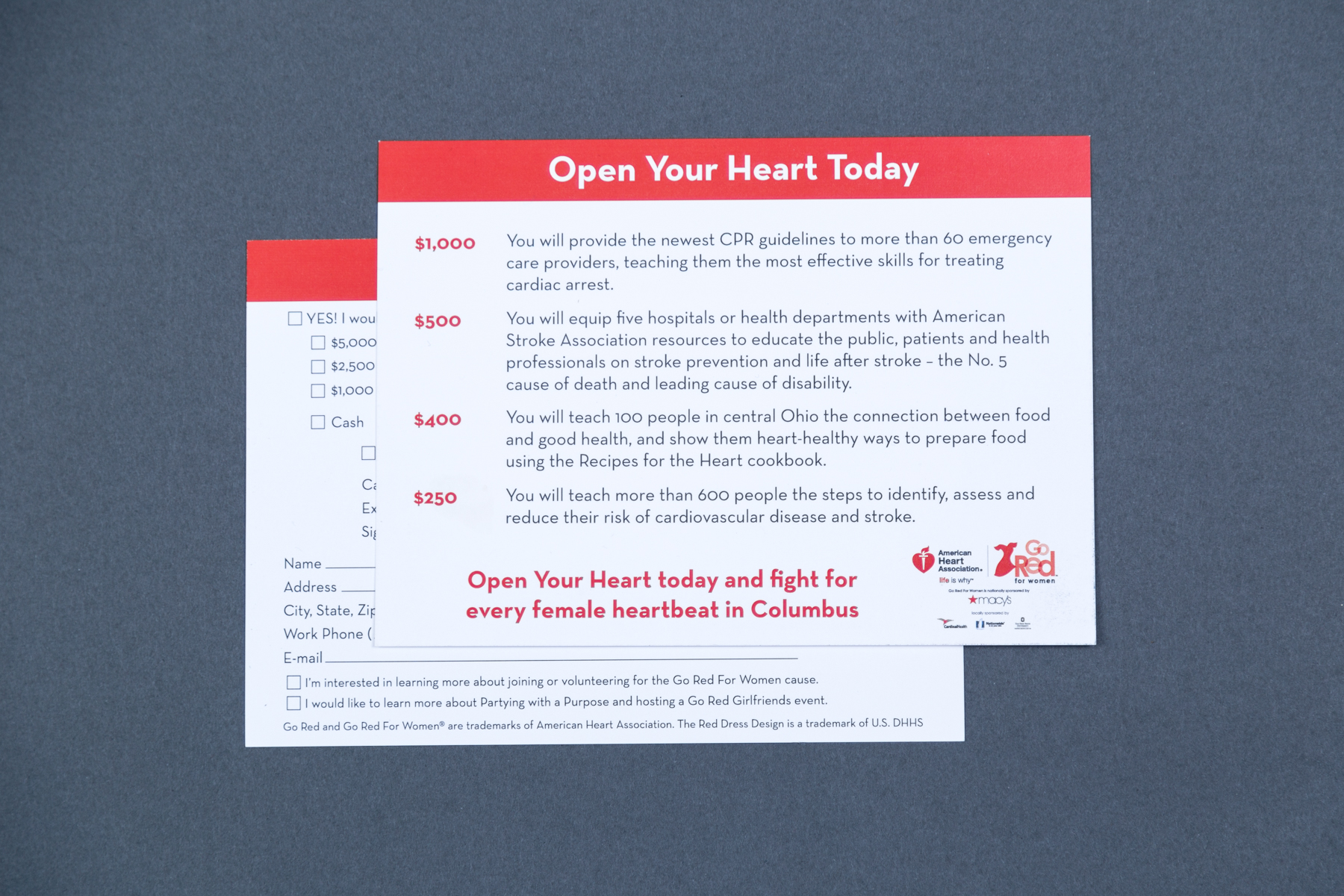
One of the key strategies to creating a powerful and memorable event is using the design of the materials to reinforce the messaging at every opportunity. For the Go Red for Women Columbus luncheon, I produced a 5-part invitation suite (3-panel invitation, RSVP card, additional 2-panel fundraising insert, 2 envelopes), a 44-page event program, donation card, dozens of signs in two sizes, Powerpoint template, and multiple digital and print ads and public service announcements supporting both the luncheon and National Wear Red Day.
The grid of community women was used across a variety of materials to create consistency. This consistency helps to increase the effectiveness of the messaging through repetitive exposure, helping to cement the importance and urgency in the viewer’s mind. In addition to the main visual element, I developed a typographic system, influenced by the national association’s branding guidelines, that was applied across all materials. Within the event program booklet, I also used a 3-square motif in the footer and a line of squares under section titles to further push the 1 in 3 concept.
Crafting any print and digital communication from consistent elements also helps to increase the professionalism of the event, subtly reinforcing to the attendees that this is a worthy cause for donation. By presenting a polished event, an organization is able to create an atmosphere of trust that they are competent in executing the education and research with the money raised.
Celebrating past accomplishments
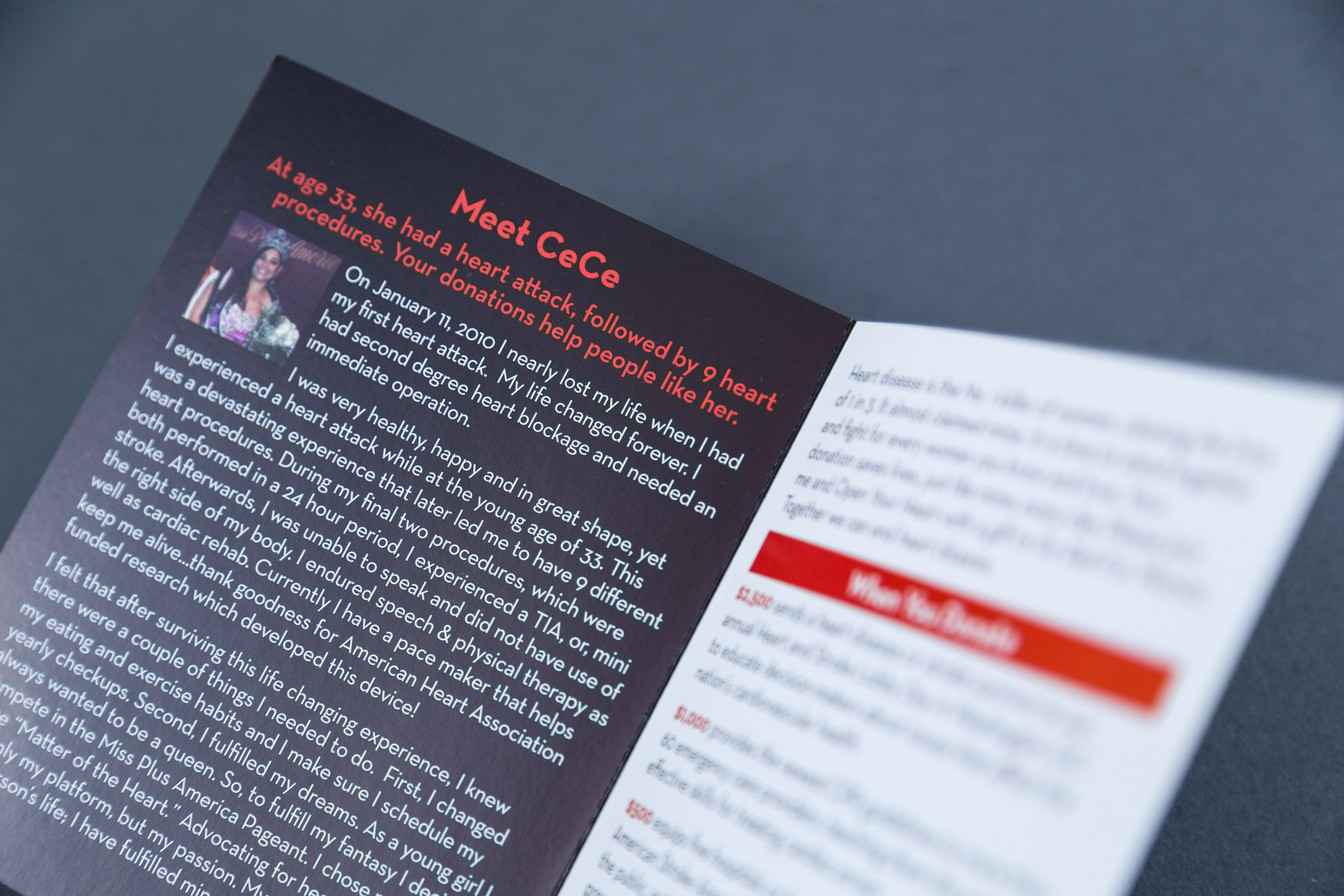
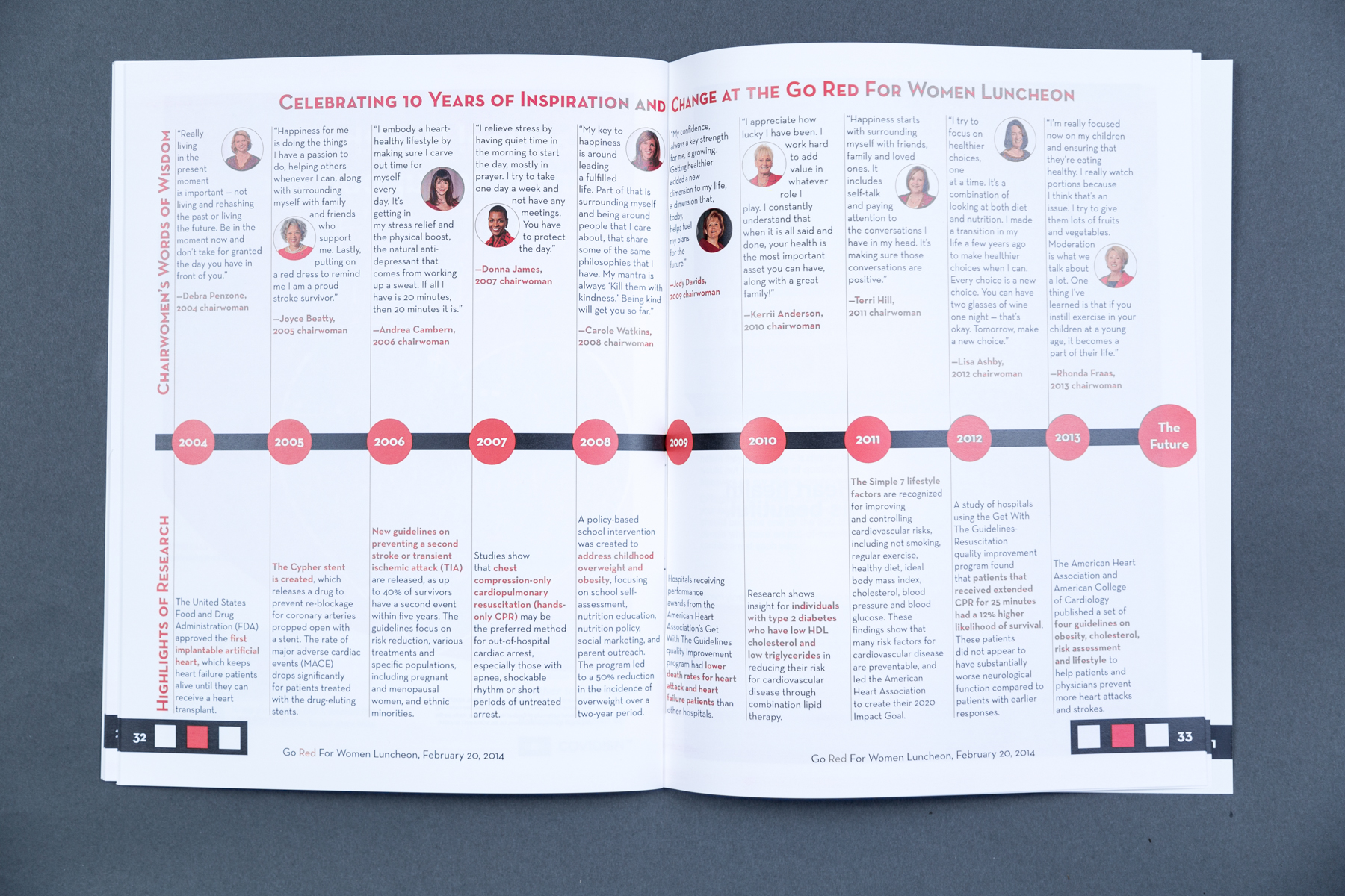
One of the benefits of celebrating a well-established annual event is the chance to look back at the important work done over the years. The client wished to use a full spread in the program and a series of ten signs to create a timeline of pivotal pieces of research and an inspirational quote from each chairperson from the corresponding years. The presentation of the information in this way was a chance to celebrate how much work the chapter had accomplished and encourage higher donation levels.
A successful event
The feedback from the invitation suite was extremely positive, with many respondents remarking on the materials. The 1 in 3 concept was reflected in the planning details, from the presentations and speakers to the tableware (1/3 of the tables featured a bright red tablecloth, further driving the point home for attendees). The entire experience added up to an event that was quite successful for the chapter, with robust attendance and on-site contributions. Donations and ticket sales showed an increase of $200,000 over the previous year.
Solve problems and achieve goals
Check out the portfolio page for this project
More Event Materials Design Projects