Real Estate Presentation and Worksheets

The Need
A real estate brokerage I work with frequently was ready to pivot their branding to something a little fresher, to represent the crop of young agents on board. They were using a 15-page printed document during client onboarding that could use a facelift in order to better connect with their customers.
The Project
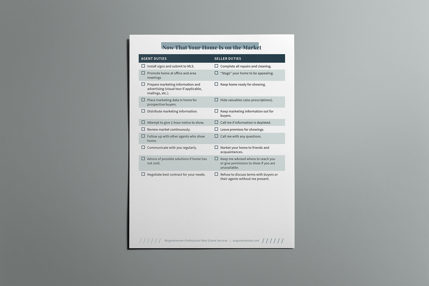
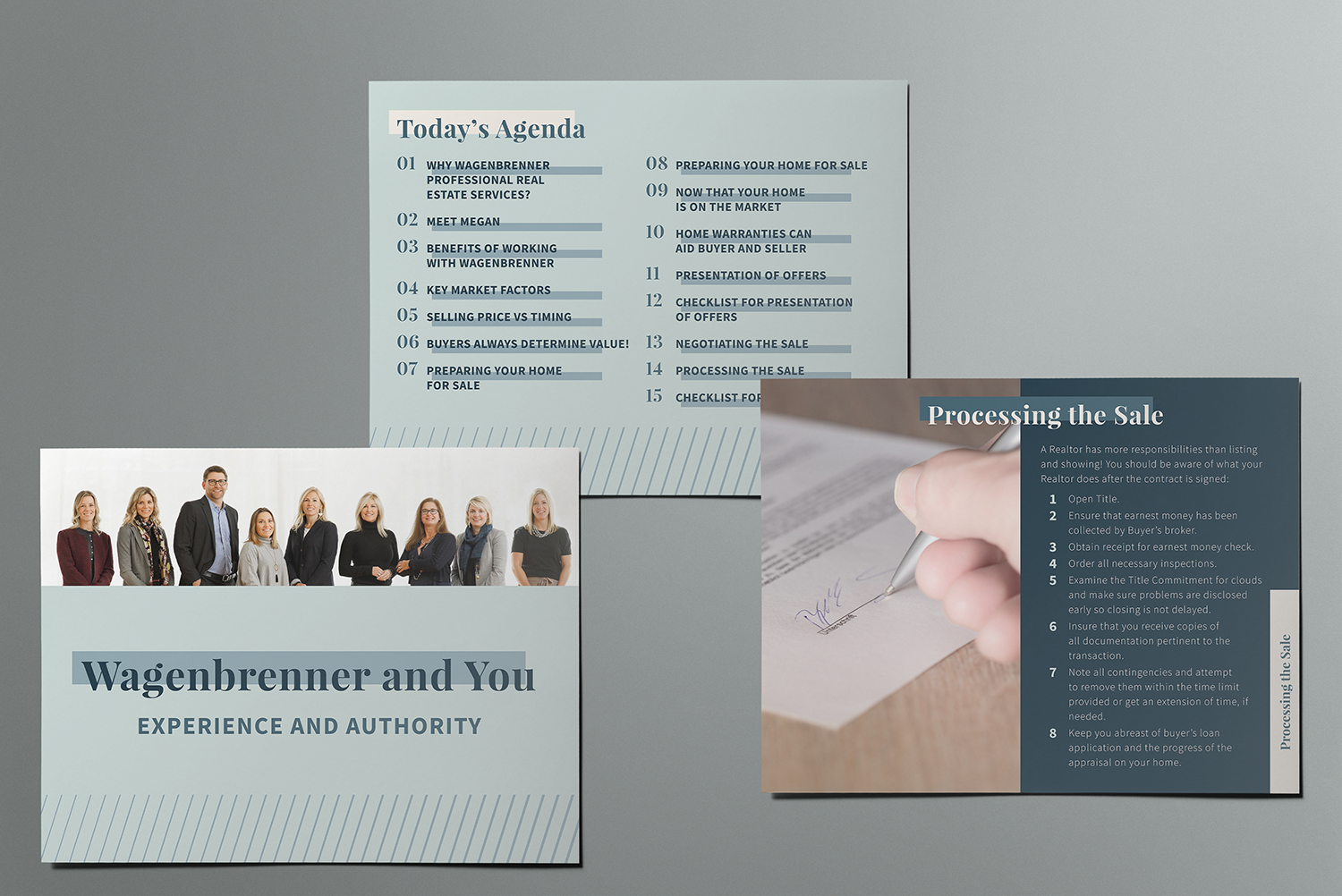
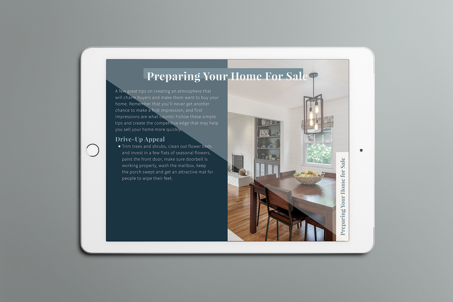
We decided that a new photo-filled presentation the agents could display on a tablet during a meeting or email to a client would represent their brokerage in a more modern light. There were some checklists that had been included in the previous printed document that wouldn’t work well as slides, so needed to be designed as a page that could either be printed or emailed, with fillable fields.

The Process
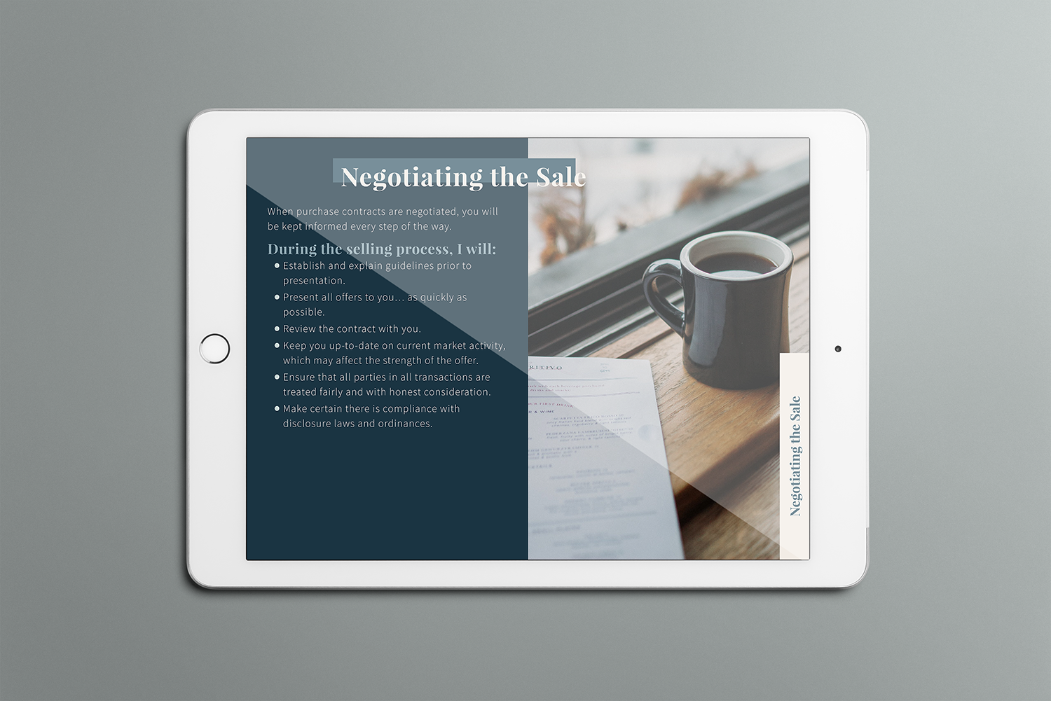
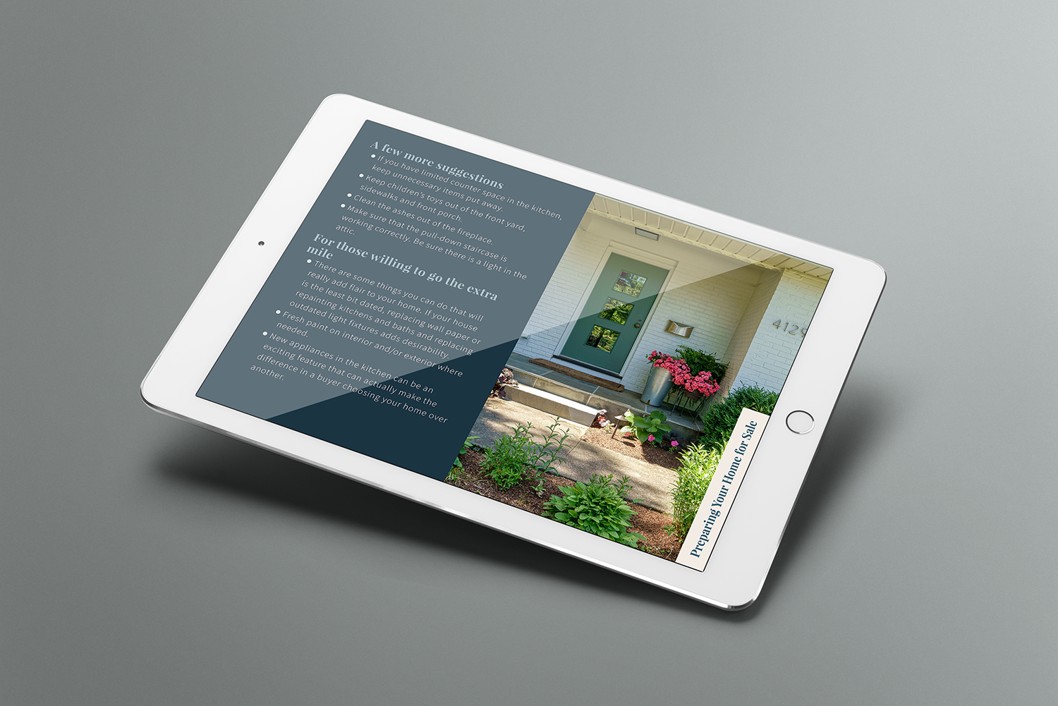
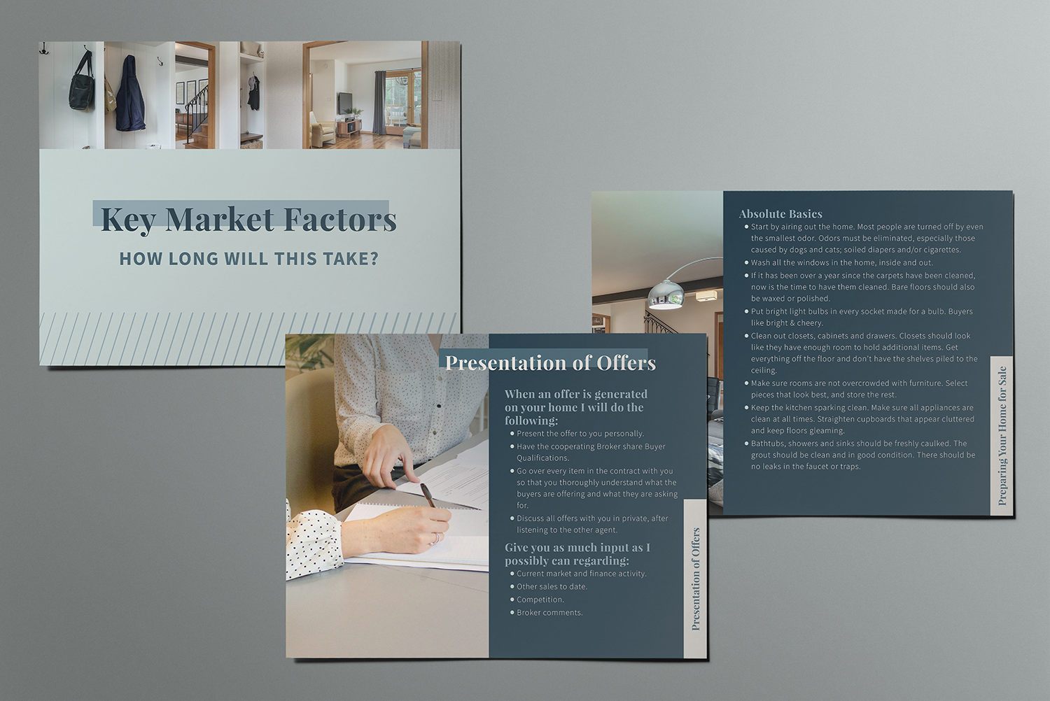
More experienced agents were able to speak more extemporaneously about the subject of listing one’s house with the brokerage, but the newer agents needed the aid of the full text of the document. To keep the slides from feeling overly text-heavy, I broke lists of bullet points across multiple pages.
I also found natural ways to separate the text into sections, which could be marked with title slides to give variety through the presentation and transition clients through the subjects more easily. I added a tab in the lower right-hand corner that shows the title of different subsections, so both clients and agents could orient themselves as they moved through the presentations. As a final piece of wayfinding, I designed a highly-stylized “agenda” page that would prepare the client for the content of the presentation as well as allow the agent to jump directly to any of the subsections they needed to.
For the styling, I followed the cues of the brokerage’s recently refreshed website, pulling stylistic elements to mimic in the presentation to create a cohesive branding experience for clients. I fleshed out a palette to give more variety and designed title and heading styles that felt fresh and layered, to emphasize the dynamism of this community brokerage, which has continued to grow and evolve through their 45 years.
To illustrate the presentation, I used a combination of stock that I sourced and real photos of homes the agents had sold to entice clients. These were complimented with a few custom diagrams to demonstrate concepts more quickly than a block of text can, cutting down on content for select slides.
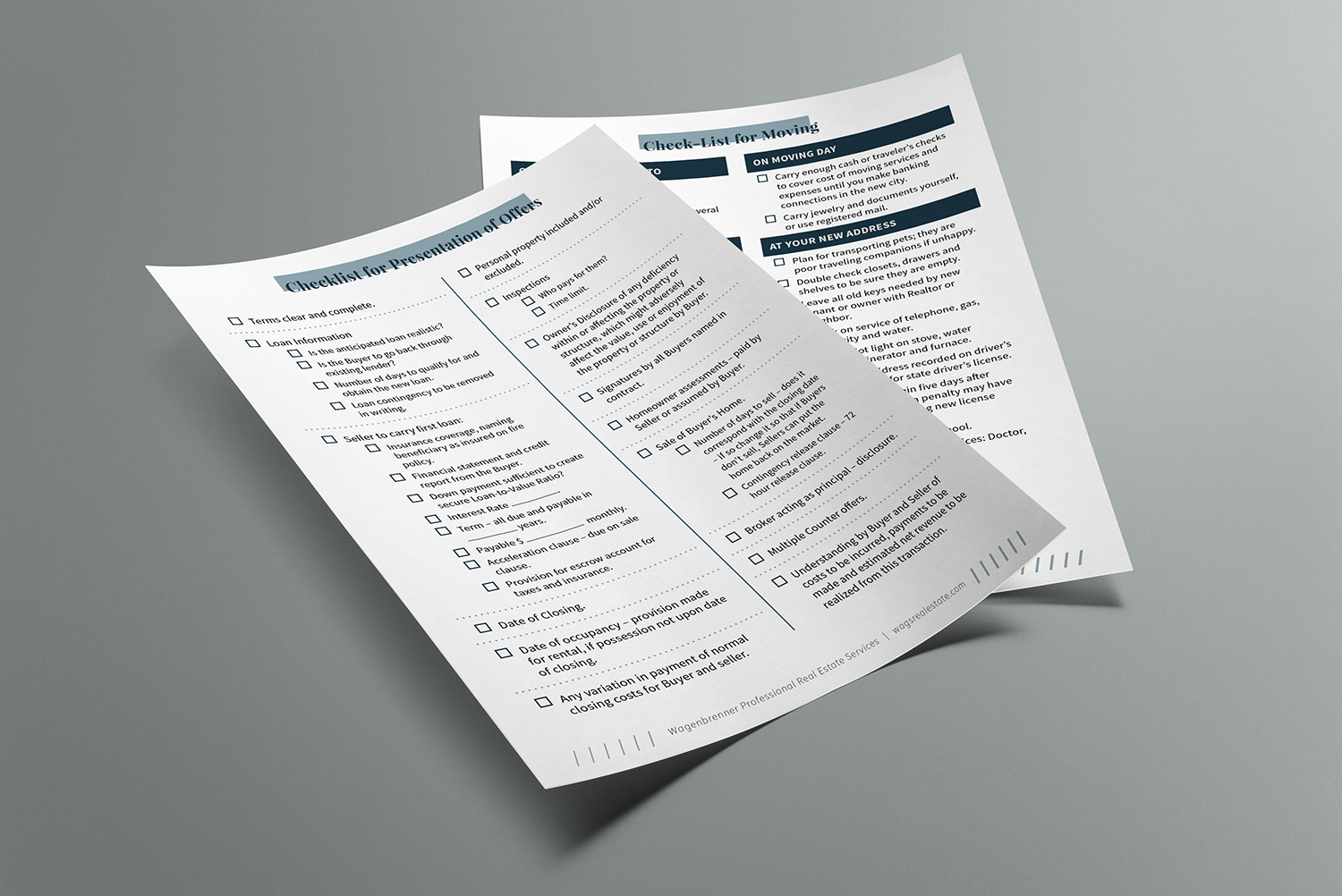
Finally, I created new versions of the checklists that the agents required, styled to coordinate with the presentation for a cohesively-branded experience. I kept these printer-friendly so the agents could produce them in-house if they wanted a hard copy to bring to the clients, but also added fillable check boxes for them to email them off to clients if that was their preferred method.