Working with a Designer
Posts to help you work seamlessly with your designer or pick up some DIY tricks yourself!
Beginner’s Guide to Finding the Perfect Visuals – Part 1: Tips for Success
One of the most dynamic elements of your design can be the visuals that go with it. While it’s definitely doable to create a straight-up typographic design (I love the challenge), having the right picture or illustration incorporated can convey a lot about your material. Images and words work together to create a complete message for your reader, so your visuals can be just as important as your beautifully-worded ideas!
You may already have a folder of stock photography your company uses, or some great illustrations you’ve used in the past that you’re eager to bring out again for your new project. However, many materials will require some new visuals to make them really shine.
While I love finding just the right visual to accompany a project, I always include this service as an add-on at my hourly rate. The reason is that researching visuals can be a very tricky thing to do and you may find what you’re looking for within 5 minutes or it could take a few hours. I like to provide a few options for each concept and I don’t want my clients to have to pay the padded price I’d have to charge in case visual research took me hours. For me, it’s just too variable to provide that service any other way.
But if you’re willing to do it yourself…
If you want to try your hand at your own visual research, I am happy to provide some resources to you and a few tips. I’ve sourced images and illustrations for dozens of projects and I have my favorite places and some ideas to keep in mind when you’re doing your own research. Let’s get started!
A quick note: Google image search does not exactly count. Just because the image is posted on the internet doesn’t mean it’s fair game to use anywhere. It’s my policy to only work with visuals that the company or organization has the license or right to use. Google image search can be a great place to get started on ideas or test out search phrases and often stock images show up there, connecting you directly to reputable sites where you can purchase. Just make sure to keep it legal, please!
This month I’ll be spending some time going through some basics and resources as well as a sample visual search with some effective techniques. Catch the whole series here!
Tips for image research success
Keep it consistent…
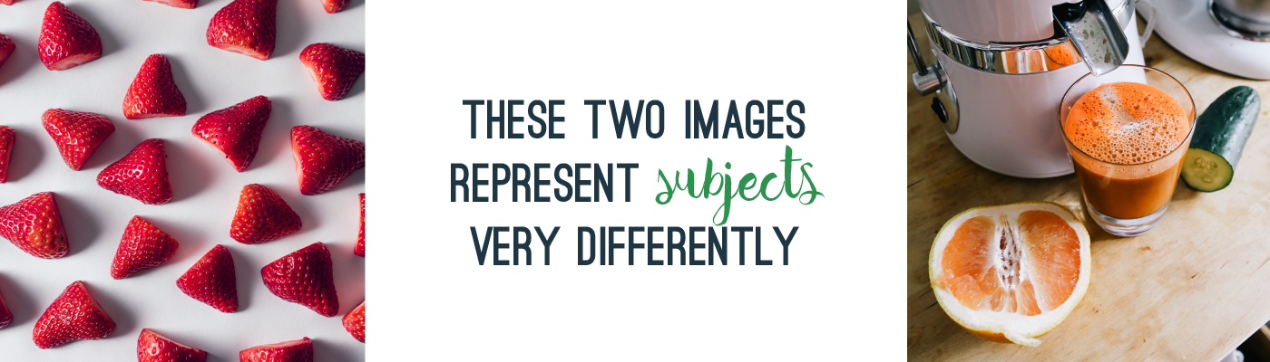
One of the most powerful but subtle approaches to design is to have visuals feel the same. If you’re looking at illustrations, choosing ones with similar approaches (cartoony vs realistic, boxy vs a hand-drawn feel) can be helpful. For photos, the same types of subjects (landscapes, people in active positions, static items) or shot composition (people or objects against a white background vs richly detailed scenes) will unify your visuals. Generally a good way to find similar styles is to check out the other work by the same artist as a visual you like (I’ll go over one way to do this in a few weeks in my sample visual search), but you can generally do this by eye, too. Think like a designer while you’re comparing images to see if they look great together!
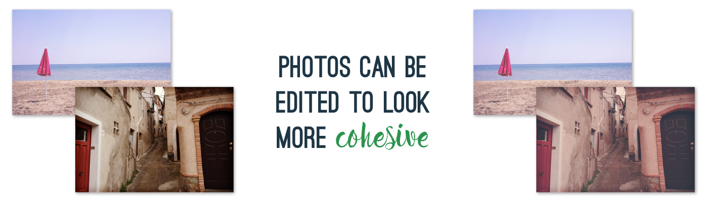
…but know that there are tricks to unify visuals, too.
One of the things you won’t necessarily have to fret about too much is color palette, because that’s something I can control. If two illustrations look fantastic side-by-side, but one is really brightly colored and the other is very muted, I can change that. In fact, I’ll probably update any illustrations you have to work with the color palette for your materials, provided they’re the right file types (we’ll go over this next week). For photos, images can be unified with a black and white color palette, muted, vintage-inspired, etc. Very specific image recoloring (say, making a complex shape another color entirely) may result in an added fee, but often can be done.
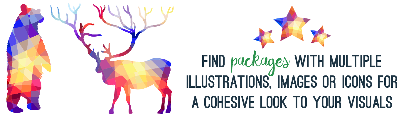
Get a package
Oftentimes a group of similar visuals will be grouped and sold together as a package or set. These can be really helpful both to get illustrations or images that fit together but also to save you money. A set might consist of dozens of icons, 10 or more images around a theme, or several freestanding illustrations.
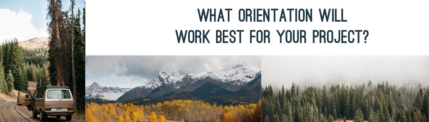
Think about orientation
Images can have a vertical (taller than it is wide), horizontal (wider than it is tall), or square orientation. Often it will work great to have images be in mostly the same orientation, so they can be used the same way (across the width of a page, down the side of an invitation, etc). Some images can be cropped (only part of the image is shown) differently, but consider an example of a vertical, tightly-framed picture of a firefighter. Changing the orientation to horizontal would probably clip out some relevant parts of the picture (body wearing uniform, nifty fire helmet). Some photographers will capture a series of pictures of the same subject in a few different orientations, so note a few different options if you see them, in case another version will work much better for your design.
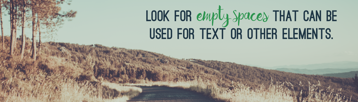
Also consider composition
Your subject doesn’t necessarily have to fill the picture. You may find a lovely picture of a Tuscan vineyard with lots of blue sky captured above it. That blue sky may serve as a perfectly neutral background in which to place a block of text within your design. Using an image to fill a page and setting text over it in areas that are not busy or overlapping the subject (grassy, concrete walls, painted walls, floors) can be a really dynamic element in your design. Look for areas with lots of consistency and minimal color change.
Hopefully these tips will help you get started in considering what kinds of visuals work best for your project and how to evaluate images and illustrations as you search!
0 Comments